
Client: Setsana
Industry : Boutique Lingerie / Retail
Services : Brand Identity & Visual Language
🚀 The Challenge
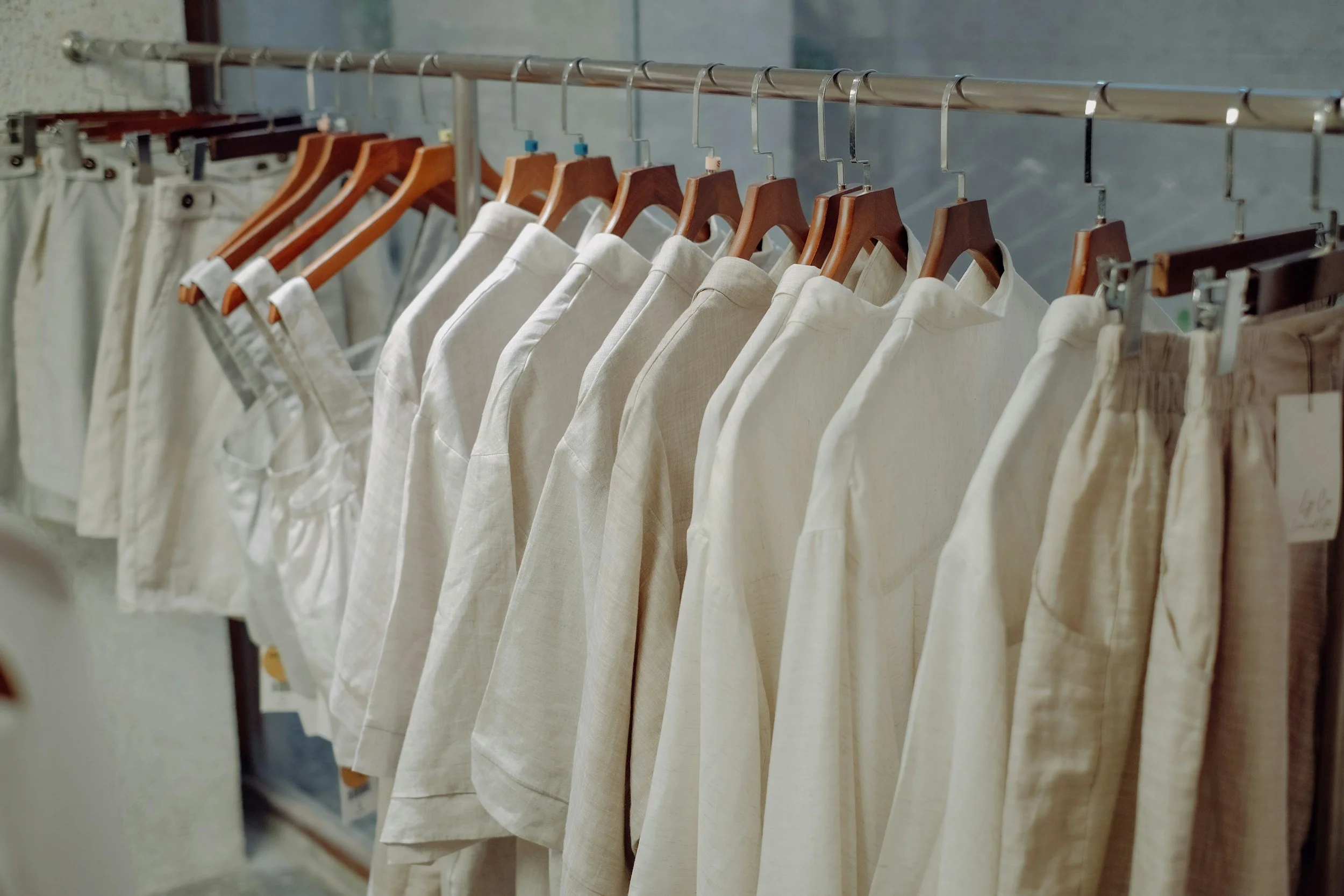
Setsana was an emerging boutique lingerie shop in Hoboken, New Jersey, created to celebrate elegance, comfort, and confidence through curated collections of designer intimates. The founders wanted a brand identity that communicated intimacy and sophistication without leaning into cliché or overt sensuality. The challenge was to design a brand that felt feminine but not fragile, luxurious yet personal, and one that would stand out among high-end competitors while remaining approachable to the local community.
🎯 Objectives
Develop a visual identity that balances refinement and approachability
Evoke feelings of confidence, softness, and timeless beauty
Design a color system and typography that appeal to a sophisticated, modern clientele
Create a recognizable mark adaptable across packaging, storefront, and digital platforms
🛠️ Our Approach
The creative direction began with understanding tone and emotion — how Setsana wanted women to feel when interacting with the brand. We drew inspiration from moments of grace and quiet confidence, focusing on the tactile, emotional connection that comes from well-crafted design.
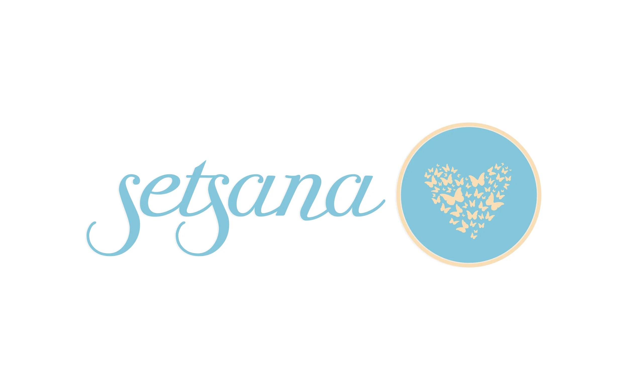
Typography became the centerpiece of the visual language. We selected a graceful script that conveys fluidity and confidence while maintaining legibility at various sizes. Its flowing forms reflect both craftsmanship and individuality, a subtle nod to the artistry behind intimate apparel.
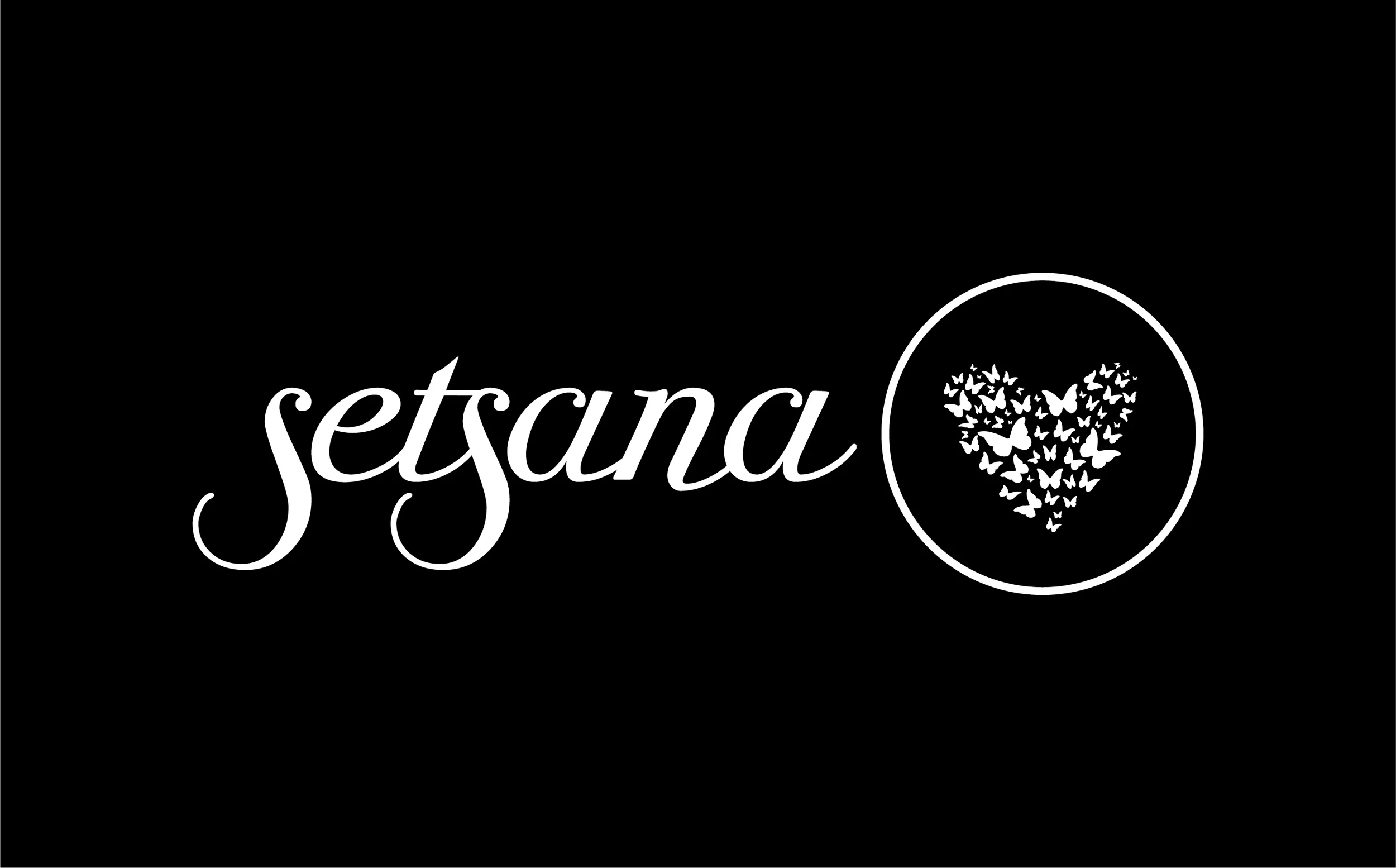
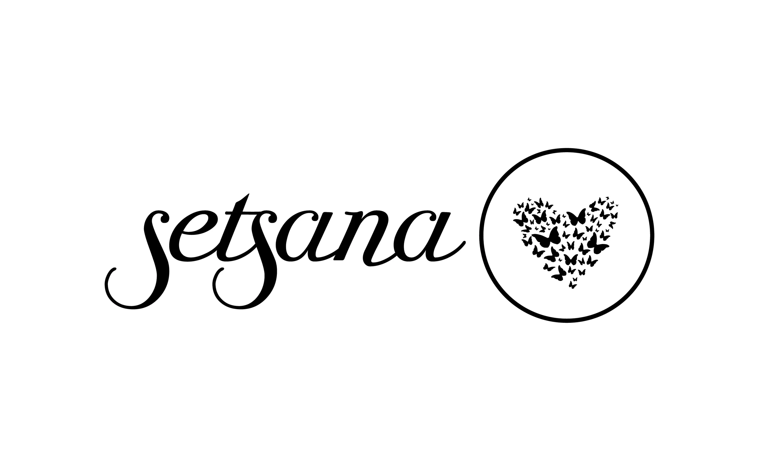
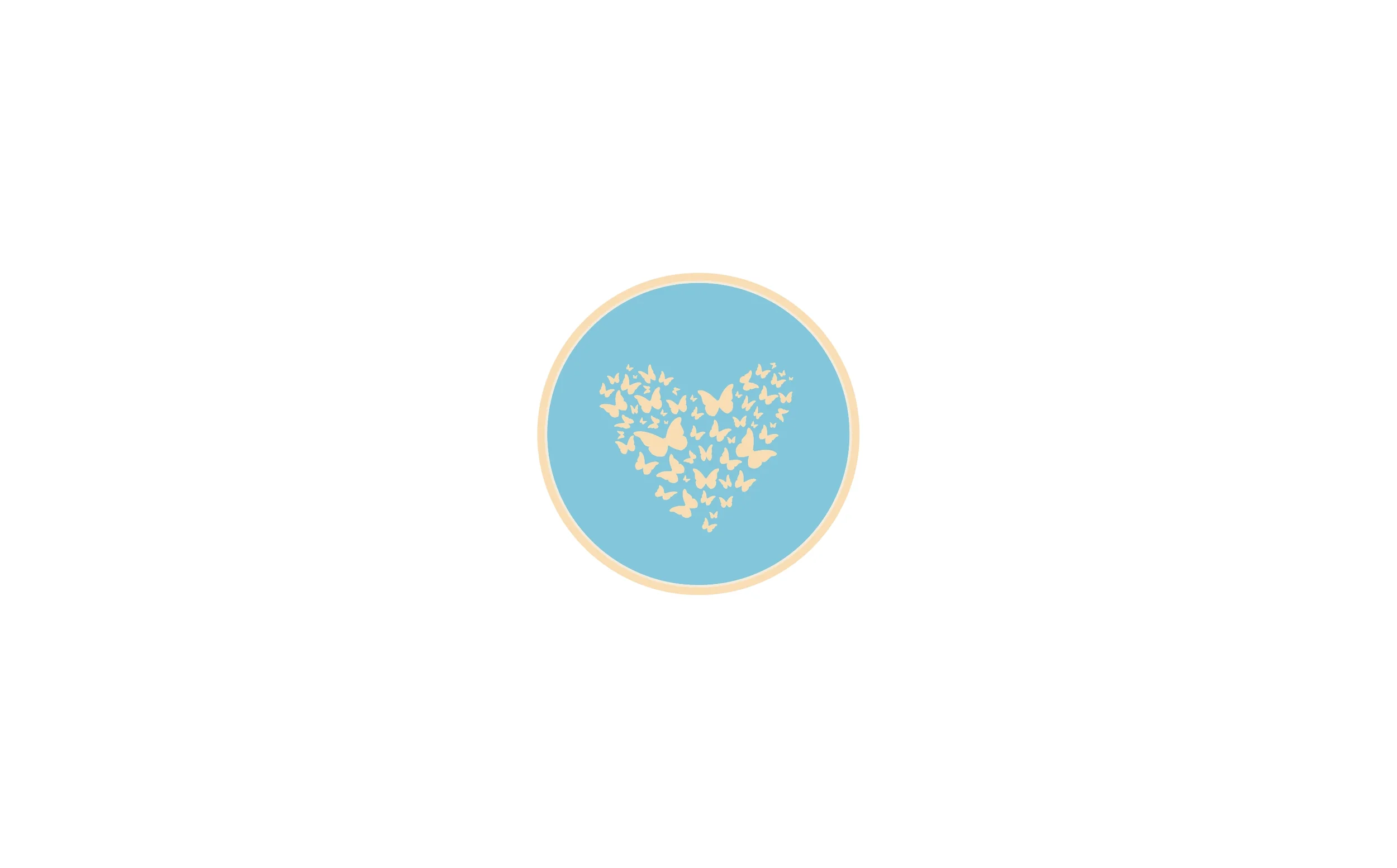
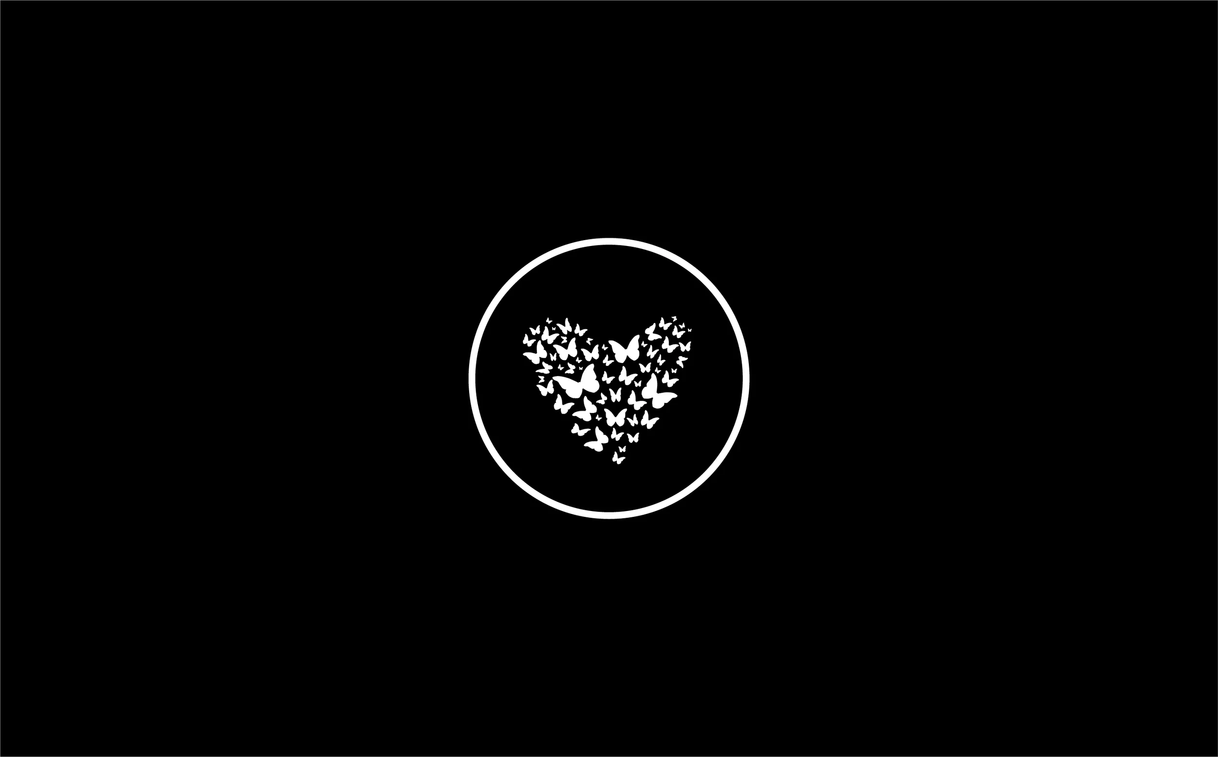
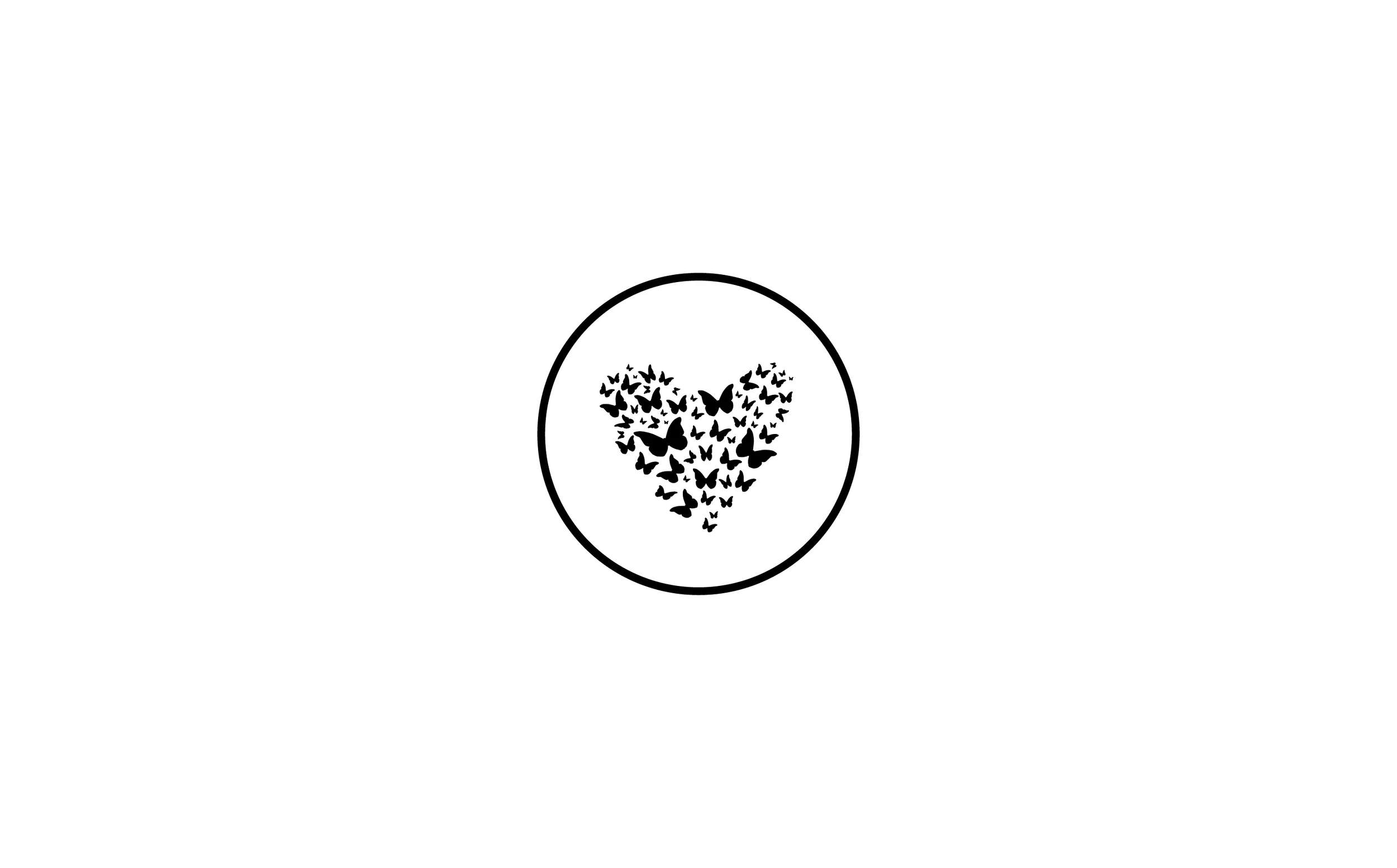
The logo’s emblem, a heart composed of fluttering butterflies, became the brand’s most expressive symbol. It represents transformation, lightness, and self-love; the emotional counterpart to the sophisticated wordmark.
The color palette; soft blues , muted creams, and deep teal accents evokes tranquility and trust while offering a contemporary twist on traditional femininity. The combination feels both serene and confident, perfectly aligned with Setsana’s tone of voice.
💡 The Solution
The final identity captures the poise and artistry of Setsana’s boutique experience. The wordmark expresses fluid grace through its calligraphic structure, creating a visual rhythm that mirrors fabric drape and motion. The soft curvature of each letter adds warmth and familiarity, ensuring that the logo feels elegant without being distant.
The icon, a circular heart formed from butterflies, reinforces the brand’s emotional foundation of transformation, beauty, and lightness. Its symmetry and balance bring calm energy to the composition, while the gold outline adds a refined touch suitable for premium retail environments.
Together, the typography and icon create a mark that feels timeless and emotionally resonant, equally at home embossed on packaging, printed on garment tags, or featured on a digital storefront.
💵 Results & Impact
Established a full visual system adaptable across packaging, signage, and e-commerce
Delivered a brand aesthetic that resonated strongly with Setsana’s target demographic
Elevated the boutique’s presentation to feel luxurious yet approachable
Helped position Setsana as a trusted, local destination for refined and personal lingerie shopping experiences
🛠️ Tools & Deliverables
Tools: Illustrator, Photoshop
Deliverables: Logo suite, color palette, typography system, packaging design, signage concepts, brand guide
💻 Roles & Team
Color Culture Roles: Creative Director, Brand Designer
Collaborators: Setsana Owner