
Client: The Marol Academy
Industry : Nonprofit / Education
Services : Brand Identity & Low Code Web Development
🚀 The Challenge
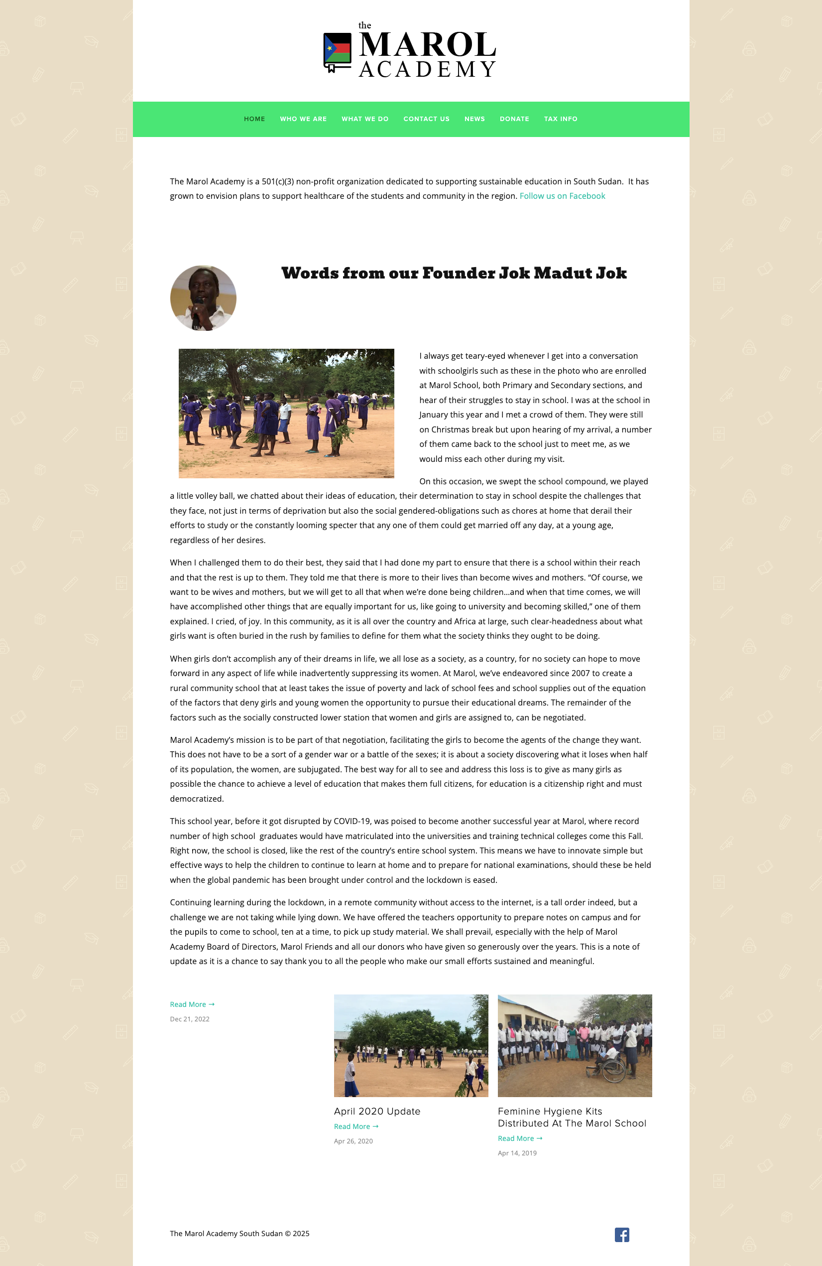
Founded in 2007 by scholar and humanitarian Jok Madut Jok, The Marol Academy began as a chalkboard beneath a tree in South Sudan with a simple vision: to bring accessible, safe, and high-quality education to children in Jok’s home village.
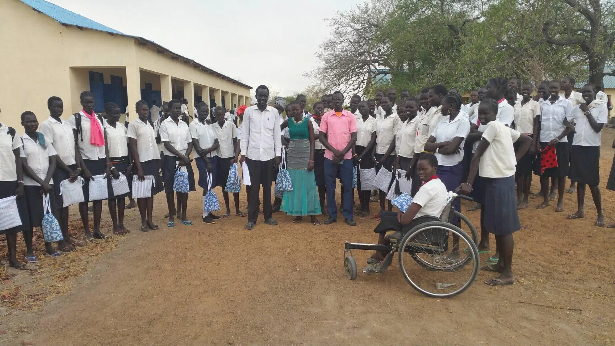
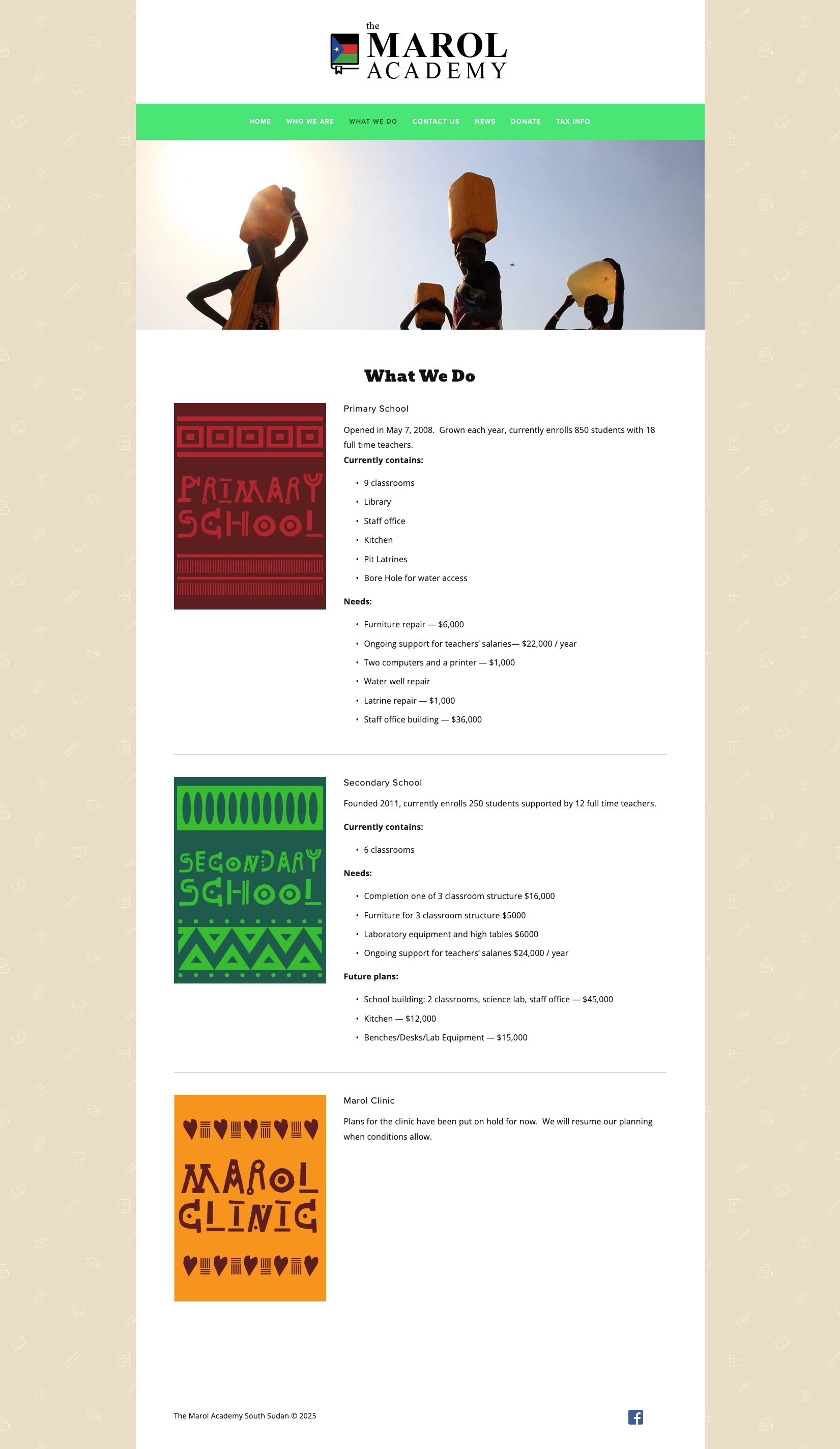
Over the years, the academy has grown into a symbol of resilience and progress, expanding to seven school buildings, 18 full-time teachers, and over 1,100 students. Despite immense national challenges including tribal conflict, economic hardship, and political instability, The Marol Academy continues to represent hope, equality, and the transformative power of education.
The challenge was to design a brand identity that reflected dignity, empowerment, and optimism, while grounding it in the cultural and national context of South Sudan.
🎯 Objectives
Develop a respectful and inspiring brand identity rooted in local and cultural meaning
Reflect the Academy’s commitment to education, equality, and opportunity
Design a mark that symbolizes growth and national pride without politicization
Create a visual system flexible enough for international fundraising, community use, & digital communication
🛠️ Our Approach
Our creative process began with a deep appreciation for The Marol Academy’s mission and story, an institution born from purpose and perseverance. We explored symbols of learning and unity, focusing on the book as a universal representation of knowledge, while incorporating national references that tie the identity to the spirit of South Sudan.
The South Sudan flag became a central inspiration, not as a political emblem, but as a cultural touchstone, a visual reminder of national resilience and pride. We balanced these symbolic elements with modern clarity to ensure usability across print, signage, and digital platforms.
The identity needed to feel academic yet accessible, local yet globally recognizable, and most importantly, hopeful. A symbol of progress in a region that continues to rebuild itself through education.
💡 The Solution
The final mark for The Marol Academy integrates a stylized book with the colors and star of the South Sudanese flag, symbolizing learning, aspiration, and unity. The book’s open form represents both knowledge and opportunity — the idea that education opens doors for individuals and communities alike.
The typography, set in a refined serif, lends credibility and permanence, while the word “Academy” is given weight and structure to emphasize educational excellence. The smaller “the” balances the hierarchy, giving focus to “Marol,” the name that carries both personal and cultural significance.
The color palette reinforces optimism and progress:
Deep blue for stability and wisdom
Teal for growth and compassion
Green for life and renewal
Together, these colors represent the natural beauty of South Sudan and the hopeful spirit of its youth.
The result is a brand identity that communicates dignity, inclusivity, and aspiration. One that feels as much a symbol of education as it does a symbol of national pride.


💵 Results & Impact
Established a recognizable identity system that embodies the Academy’s mission and values
Supported fundraising and awareness initiatives both locally and internationally
Strengthened visual cohesion across school signage, student materials, and digital channels
Helped communicate a narrative of progress, equality, and hope to donors and partners worldwide
🛠️ Tools & Deliverables
Tools: Adobe Illustrator, Photoshop, Squarespace
Deliverables: Logo system, color palette, typography guide, branded templates, presentation materials, website
💻 Roles & Team
Color Culture Roles: Creative Director, Brand & Web Designer
Collaborators: The Marol Academy Foundation
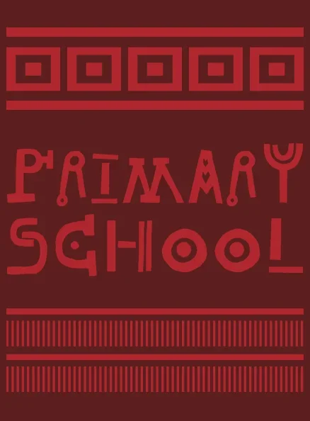
Marol Academy School Branding
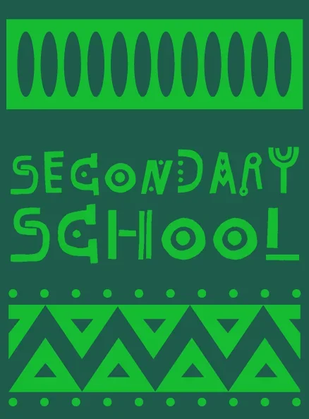
Marol Academy School Branding 2
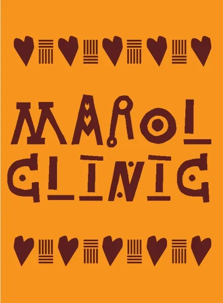
Marol Academy Clinic Branding
Marol Academy Home Page (Website)

Marol Academy Home Page (About)

Marol Academy Home Page (Donations)
Marol Academy Home Page (Services)