
Client: Jot & Tittle
Industry : Education / Admissions / Writing Services
Services : Brand Identity Creation & Website Design
🚀 The Challenge
A group of investors approached Color Culture Design with a concept for an MBA admissions essay marketplace; a platform connecting applicants with past papers, editors, and consultants who specialize in crafting standout admissions narratives.
The challenge was to create a brand identity that exuded intelligence, clarity, and precision while maintaining warmth and approachability. The name, Jot & Tittle, refers to the smallest marks of written law, details so fine that their presence or absence could change meaning entirely. The brand needed to embody that same reverence for craftsmanship, focus, and narrative integrity.
🎯 Objectives
Create a conceptual brand system for an MBA essay marketplace
Reflect precision, intelligence, and credibility through design
Maintain a visual tone that balances academia with modern professionalism
Establish strong recognition through a minimal, symbol-driven logo system
🛠️ Our Approach
We began by grounding the brand in its etymological strength. The phrase “jot and tittle” immediately evokes precision and respect for detail — a fitting metaphor for an admissions service built on clarity of thought and communication.
The design direction focused on typographic authority and symbolic restraint. We leaned into bold geometry and modern editorial balance, avoiding cliché academic motifs. Instead, the visual identity draws inspiration from editorial design, notetaking, and craftsmanship, translating these ideas into clean visual form.
Color psychology played an important role. A deep red (#D90000) was chosen to represent both academic tradition and editorial precision — a nod to the red pen of an editor’s markup — contrasted against soft neutrals and graphite tones to maintain sophistication and clarity.
💡 The Solution
The resulting identity is minimal, deliberate, and typographically confident. At its center is a seal-style mark featuring a geometric pencil icon, a symbol of refinement and authorship, enclosed within a scalloped badge that nods subtly to both academic seals and editorial emblems. This form conveys credibility and a sense of trust, essential for an education-focused marketplace.
The wordmark employs a modern sans-serif typeface with balanced letterforms and clear readability, ensuring strength in both digital and print applications. The ampersand acts as a pivot between “Jot” and “Tittle,” reinforcing the partnership between writer and editor, every detail in service of the story.
Together, the identity expresses a modern academic tone: structured yet approachable, sharp yet human. It feels as natural on a startup pitch deck as it does embossed on a stationery suite or mobile app icon.
“Every mark matters. Jot & Tittle celebrates the power of precision — where small details tell the biggest stories.”
This project reflects Color Culture’s ability to build clarity and distinction from concept to identity, creating brands that think before they speak.
💵 Results & Impact
Delivered a conceptual identity system ready for investor presentations and prototype branding
Established a clear design framework adaptable for digital products and editorial collateral
Provided strategic direction for color, typography, and visual tone to guide future product UI
🛠️ Tools & Deliverables
Tools: Illustrator, Photoshop, Figma
Deliverables: Logo mark and wordmark, color palette, typography system, brand guide, investor presentation assets, Web Design (digital marketplace)
💻 Roles & Team
Color Culture Roles: Creative Director, Brand Designer, Web Designer
Collaborators: Investor group founding team

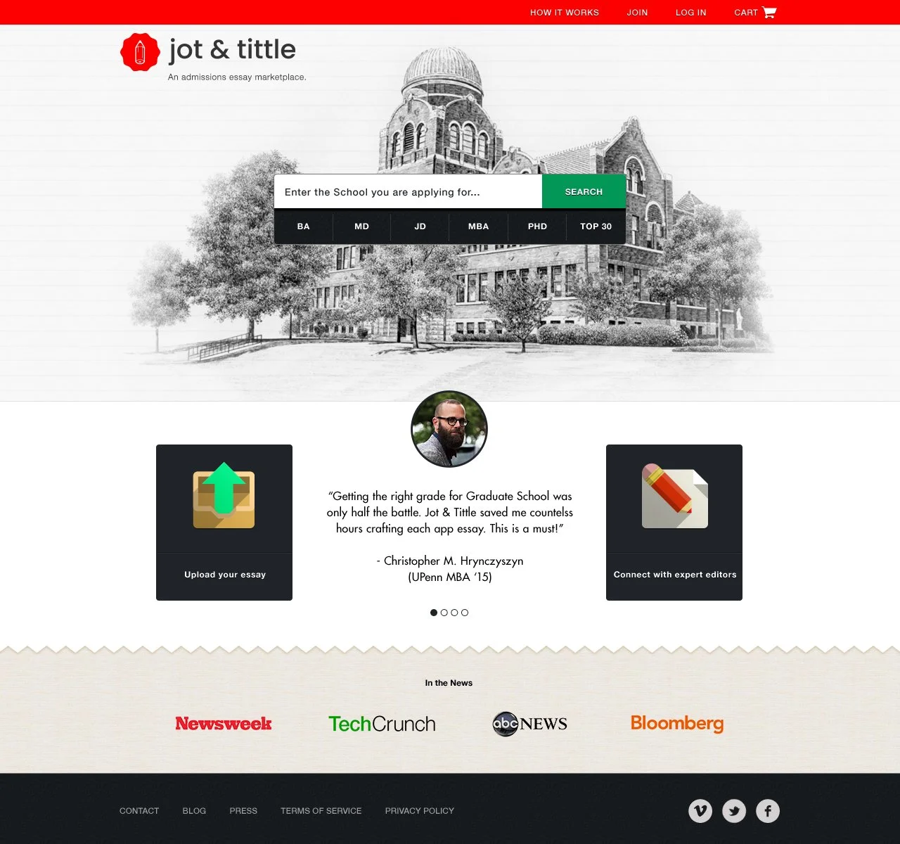
Jot & Tittle Home Page Design