

Client: Bucks Family Medicine
Industry : Healthcare / Family Practice
Services : Brand Identity Creation
🚀 The Challenge
Established in 1982, Bucks Family Medicine is a cornerstone of community healthcare in Bucks County, Pennsylvania. After nearly four decades of service, their existing branding no longer reflected the warmth, trust, and continuity of care that defined their practice.
The goal was to create a refreshed identity that honored their long-standing roots while introducing a more cohesive, welcoming, and regionally inspired brand. The new identity needed to feel both familiar and timeless, capturing the heart of family medicine through a distinctly local lens.
🎯 Objectives
Modernize a legacy healthcare brand while preserving its heritage and trust
Draw inspiration from Bucks County’s cultural and architectural icons
Create a visual system that conveys warmth, family connection, and local pride
Build a scalable brand for use across signage, digital assets, and printed materials
🛠️ Our Approach
Our creative direction was grounded in nostalgia and place. We revisited imagery reminiscent of Norman Rockwell’s Americana, evoking the simplicity of family care and the tradition of local doctor visits. A trusted physician who knows each generation by name.
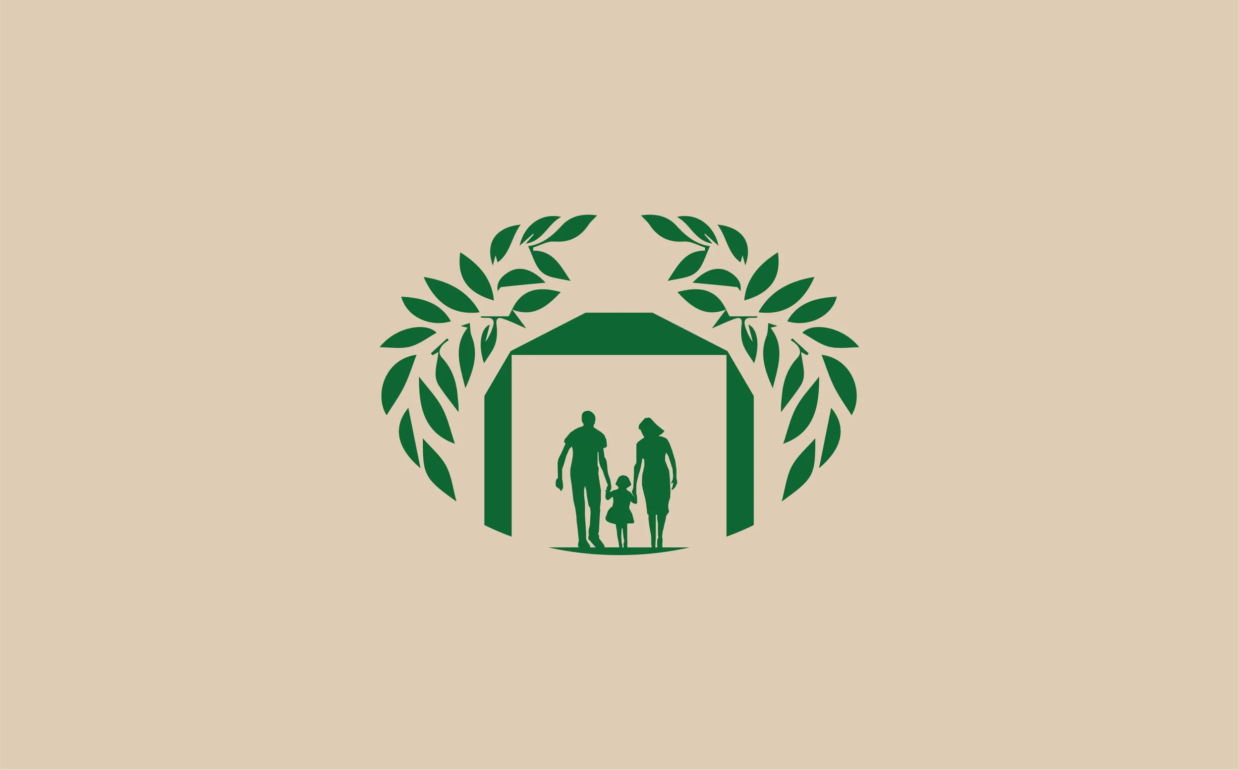
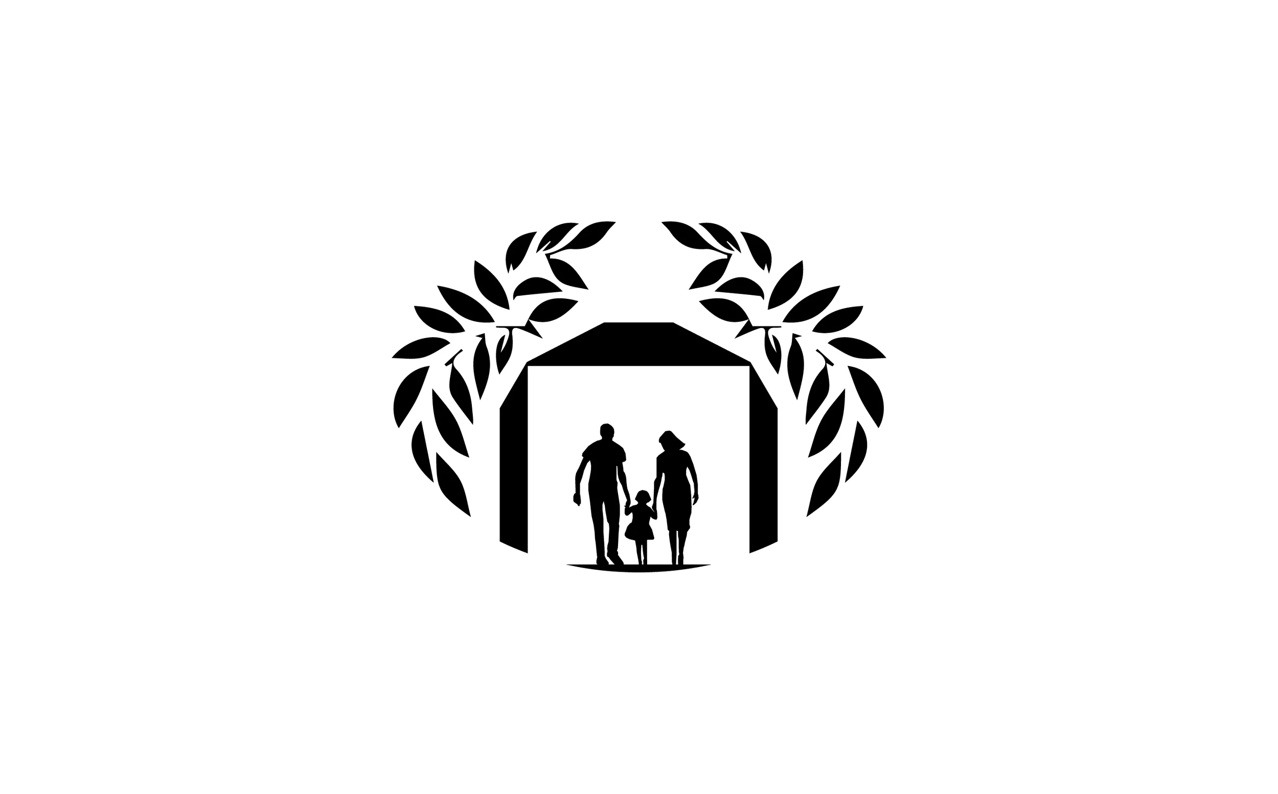
We then turned to Bucks County’s architectural identity, particularly the covered bridges that define the region’s landscape. These bridges, symbols of connection and protection, became the foundation of the logo’s visual narrative.
From there, we built an identity system around the concept of shelter and continuity — a design that would feel deeply personal to local residents while remaining clear and professional in medical contexts.
💡 The Solution
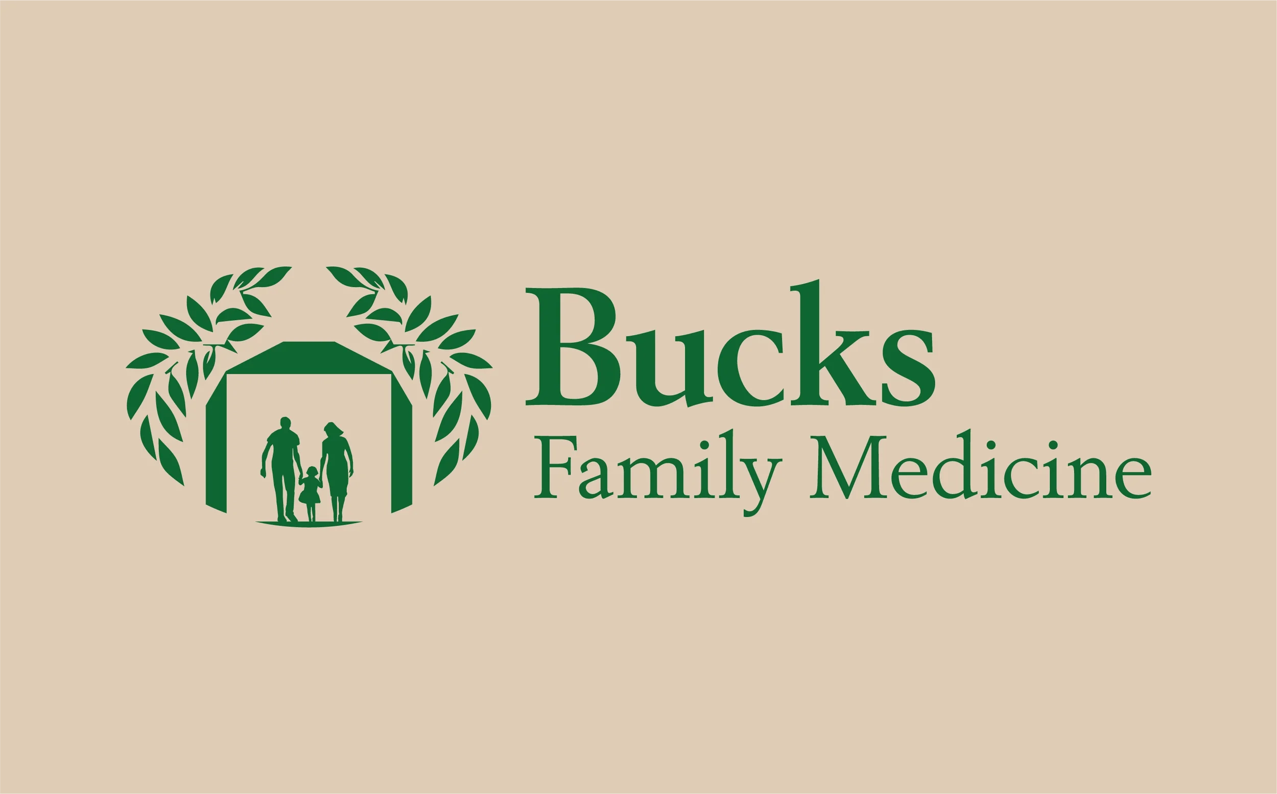
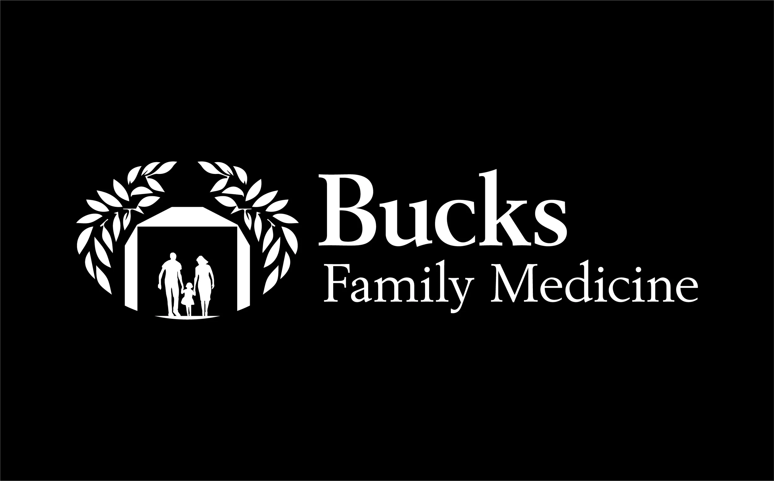
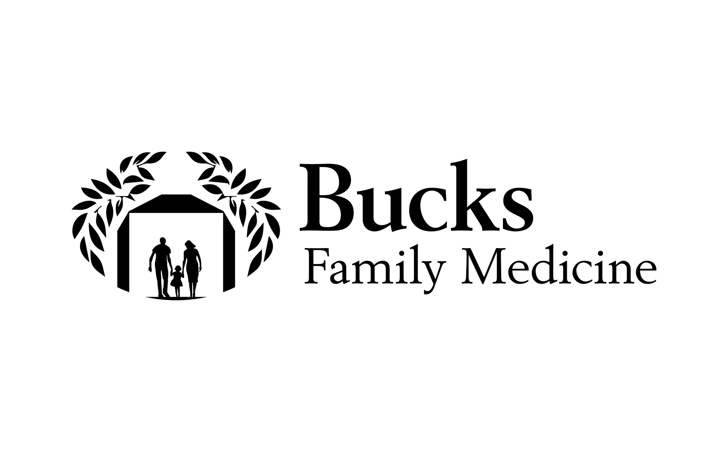
The final mark for Bucks Family Medicine features a family silhouette standing beneath a stylized covered bridge, framed by two leafy arcs that symbolize growth, care, and generational continuity. The structure acts as both literal and metaphorical protection — a place of comfort and stability that mirrors the practice’s long-standing role in the community.
The typography combines a traditional serif typeface for “Bucks” with a lighter, complementary treatment for “Family Medicine,” establishing a balance between legacy and clarity. This pairing evokes trust and sophistication without feeling corporate or sterile.
The color palette draws directly from the natural tones of Bucks County’s countryside: deep evergreen and soft leaf green to reflect vitality and renewal, while pale blue and warm beige add calm and familiarity. Together, these hues communicate health, compassion, and local character.
Applied across signage, letterhead, and digital interfaces, the identity presents a unified visual experience that is both approachable and enduring — much like the practice itself.

💵 Results & Impact
Delivered a revitalized identity that resonated with both long-time patients and new families
Strengthened local brand recognition through regionally inspired design elements
Established a cohesive design system for consistent use across physical and digital touchpoints
Reinforced the practice’s legacy of personalized, family-centered care
🛠️ Tools & Deliverables
Tools: Illustrator, Photoshop
Deliverables: Logo suite, color palette, typography system, signage concepts, business collateral, brand guide
💻 Roles & Team
Color Culture Roles: Creative Director, Brand Designer
Collaborators: Bucks Family Medicine administrative and leadership teams