
Client: Blanco
(Color Culture Original)
Industry : Wellness / Audio Technology
A Sleep App for Families and Dreamers
Services : Brand Identity, Product Design, Cross-Platform Development
🚀 The Challenge
With three young children, white noise became a nightly ritual in our home, something that traveled with us wherever we went. I wanted a simple and reliable app that could play soothing loops of bedtime sounds across any device. At the same time, I saw an opportunity to learn Flutter, Google’s cross-platform development framework.
The goal was to build an app that could serve both as a useful tool for my family and as a design and technical experiment that would stretch my creative and engineering skills.
🎯 Objectives
Develop a cross-platform Flutter app for iOS and Android
Deliver a minimal, soothing interface optimized for nighttime use
Establish a playful, distinctive brand identity within the crowded sleep-app space
🛠️ Our Approach
The project began with personal need and curiosity, turning a family-driven idea into a creative laboratory for design and development.
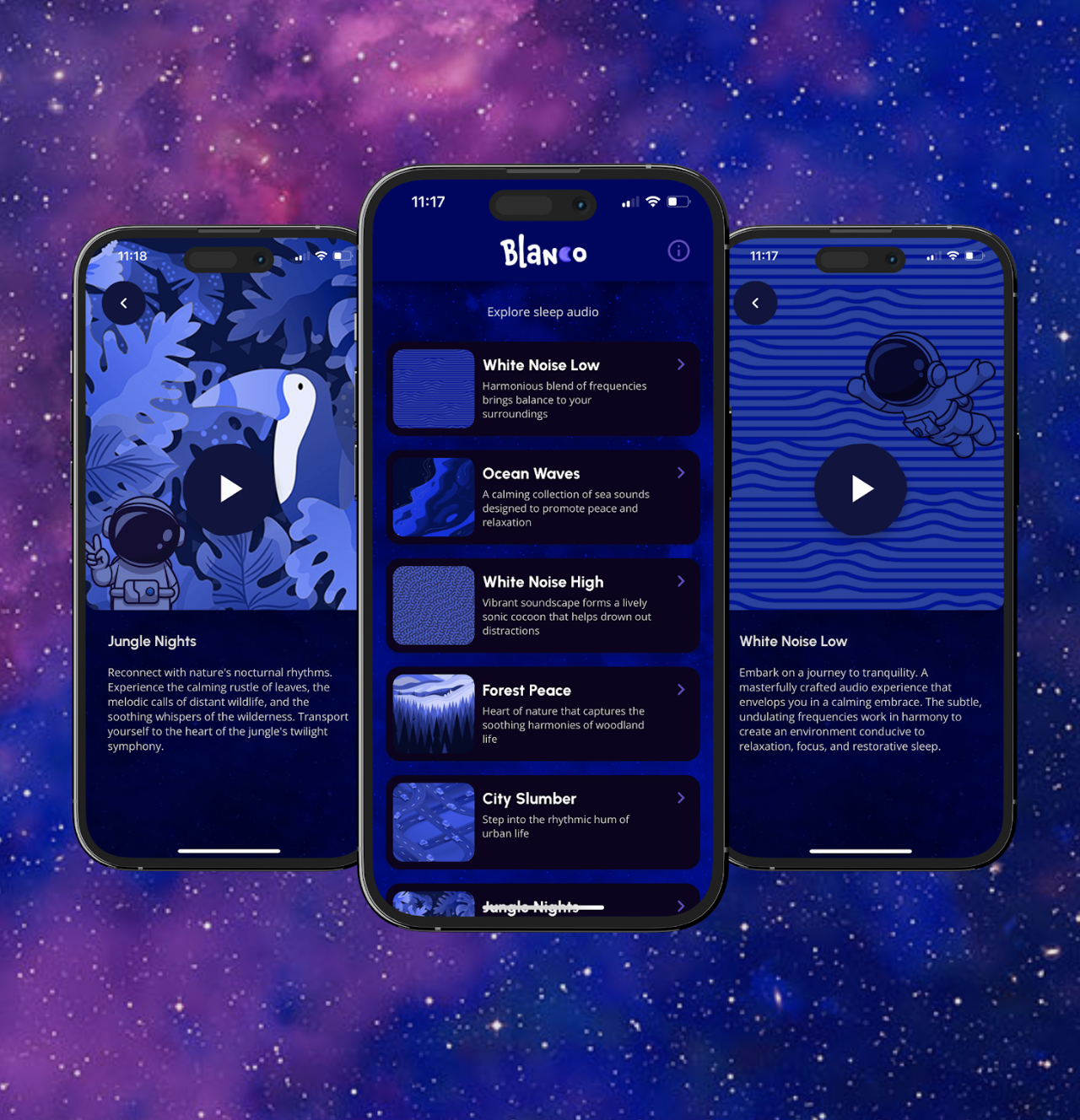
The design vision centered around ease, calm, and warmth. I explored deep purples and midnight hues to create a screen experience that would be comfortable in dark environments. The typography followed that same spirit, rounded and approachable, pairing perfectly with the app’s tranquil purpose.
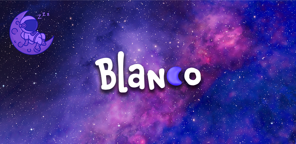
As the visual language evolved, I introduced a recurring character: a small astronaut peacefully floating through space. The figure added a sense of narrative and whimsy, while the cosmic gradients created a dreamlike atmosphere that reflected the app’s function and mood. Each track illustration became its own miniature world, helping the user feel calm and immersed as they browsed different sounds.
💡 The Solution
The final identity, seen in the Blanco logo and interface, embodies calm playfulness that feels both serene and imaginative.
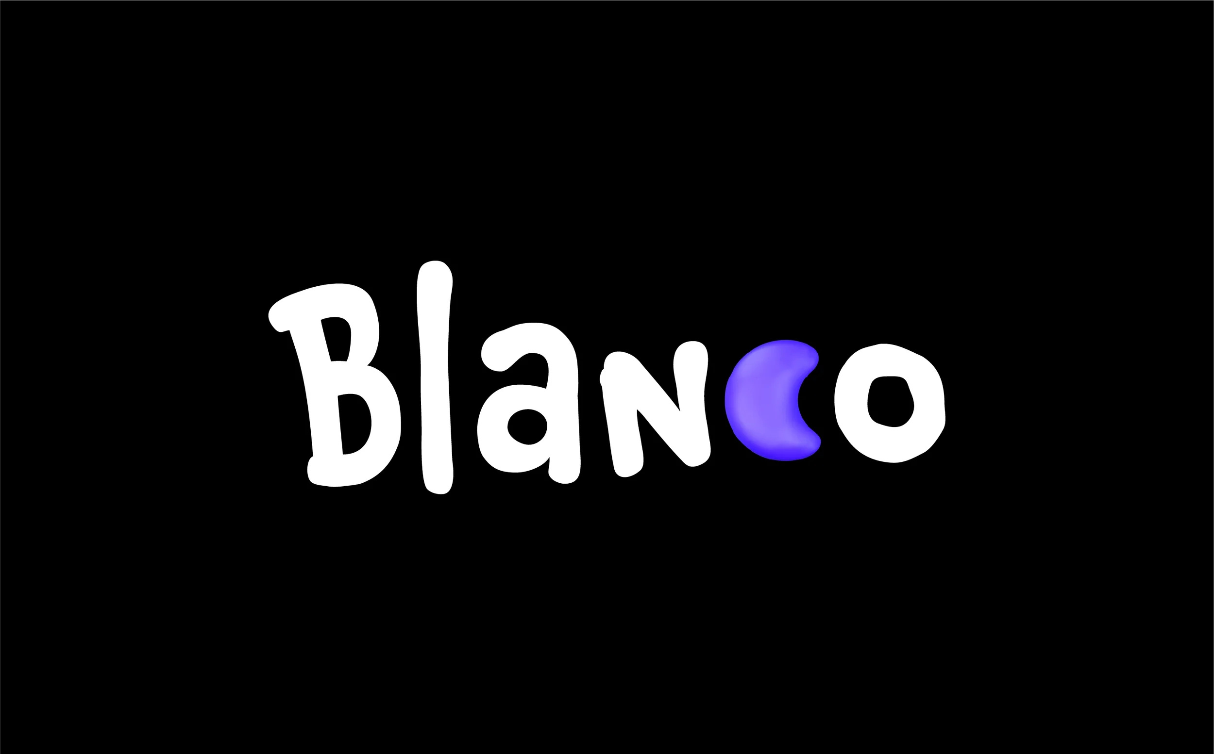
The wordmark uses a softly rounded script font that feels hand-drawn and personal, evoking the comfort of bedtime stories and the warmth of a parent’s voice. Each letter has a subtle bounce and looseness that gives the logo gentle movement, as if floating through space and mirroring the app’s dreamy theme.
The crescent-moon “C” serves as a visual wink and immediate symbol of nighttime rest. Its glowing gradient ties back to the celestial palette and reinforces the tone of quiet wonder. Together, the typography and mark project a tone that is friendly, whimsical, and soothing, yet polished enough to feel premium in digital storefronts.
The color palette of lavender, violet, and cosmic blue deepens the night-sky narrative and evokes the serenity of deep sleep. The astronaut motif completes the story, drifting peacefully through a galaxy of sound and reinforcing the brand’s purpose as a calm and imaginative companion for bedtime.
The resulting visual system strikes a balance between family-friendly charm and design sophistication, standing out as approachable and refined across mobile screens.
💵 Results & Impact
Built a fully functioning Flutter prototype and audio playback loop system
Used regularly by my family during travel and bedtime routines
Served as a self-directed exploration into app architecture, Flutter widgets, and cross-platform deployment
Inspired future Color Culture explorations into wellness and sound-based digital experiences
🛠️ Tools & Deliverables
Tools: Figma, Illustrator, Flutter, Dart, Firebase, FlutterFlow
Deliverables: Logo, UI design system, Flutter build, audio loop engine, app store assets
💻 Roles & Team
Color Culture Roles: Designer, Developer, and Creator
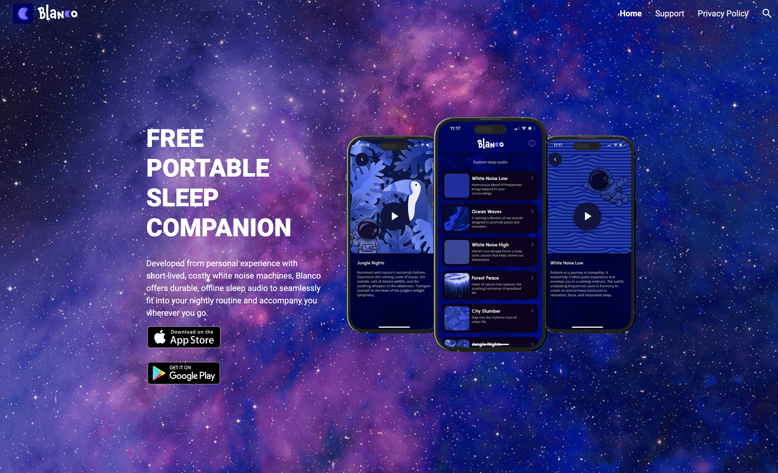
Blanco Sleep App Marketing Landing Page
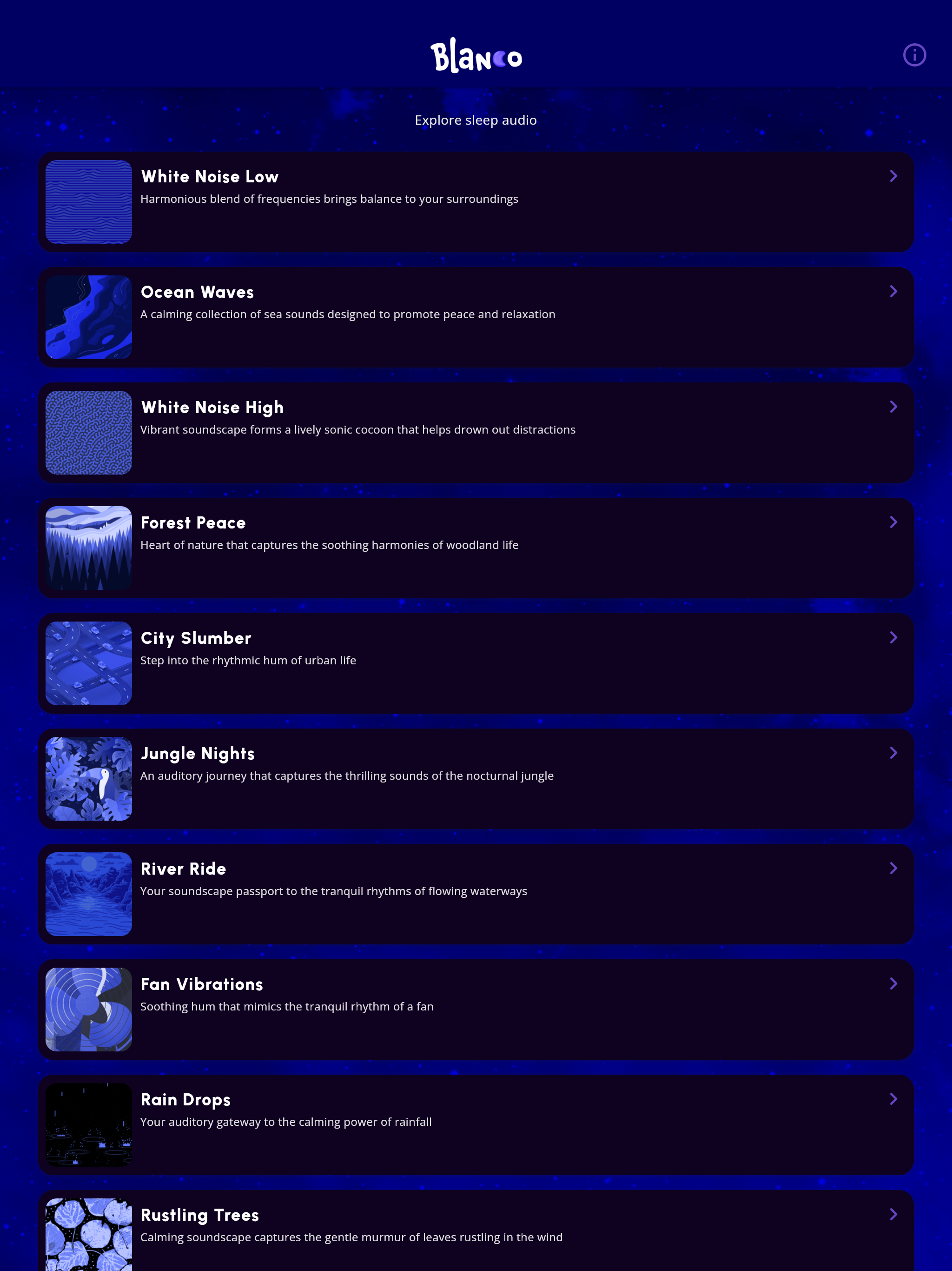
Blanco Tablet Application Screen
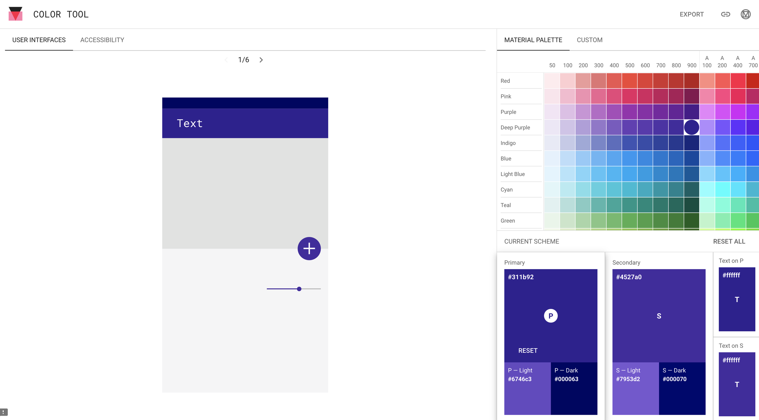
Blanco Branding Color Palette
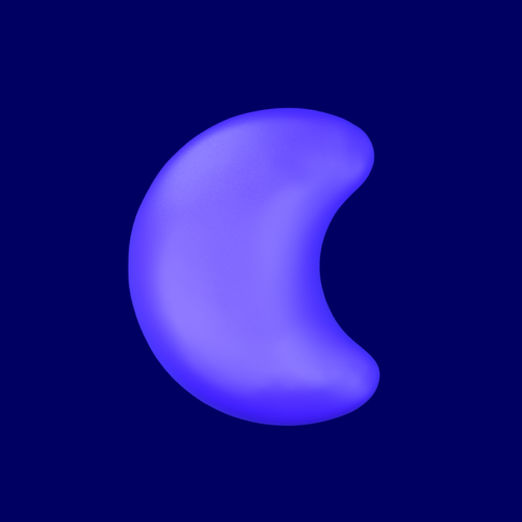
iOS Appstore and Android Playstore Icon

Rustling Trees Mobile Application Screen
Android Playstore Promotional Banner

“A bedtime sound app built for my kids and a playground for learning Flutter.”
Blanco became a bridge between family life and creative experimentation, a reminder that meaningful design often starts by solving your own simple, human needs.
-Christopher Hrynczyszyn