
Client: A.A. Sayia & Company, Inc.
Industry : B2B Spice Brokers & Agents (Hoboken, NJ)
www.aasayia.com
Services : Brand Identity, Visual System Modernization, Website Design & Development, Print Design Collateral
🚀 The Challenge
Founded in 1917, A.A. Sayia & Company is a heritage spice brokerage deeply rooted in family tradition and global trade. Their branding had remained largely untouched for over three decades, with a visual identity that no longer reflected the sophistication, credibility, or scale of their modern operations.
The challenge was to honor a century of legacy while carefully modernizing the brand for today’s digital and print landscape. We needed to walk a fine line between classic and current, preserving the trust and history that defined the company while introducing clarity, refinement, and renewed visual distinction.
🎯 Objectives
Modernize a 30+ year-old identity without losing historical integrity
Design a refined typographic system rooted in tradition yet optimized for contemporary use
Convey craftsmanship, trust, and global trade through a timeless mark
Elevate the visual tone across B2B materials and digital channels
🛠️ Our Approach
We began by studying the company’s history and artifacts: letterheads, shipping logs, and early 20th-century correspondence that reflected the character of A.A. Sayia’s brand lineage. The goal was preservation through precision, to identify what made the mark timeless and amplify it through contemporary craft.
Typography became the centerpiece of the redesign. We explored a wide range of traditional serif fonts, focusing on ligatures and glyphs that naturally conveyed partnership and heritage. This typographic foundation not only evoked a sense of trust but subtly referenced the interconnected nature of spice trading and family legacy.
To balance history with modern readability, we paired classical serif structures with clean spatial layouts, simplified ornamentation, and understated textures that lent a tactile, premium feel.
💡 The Solution
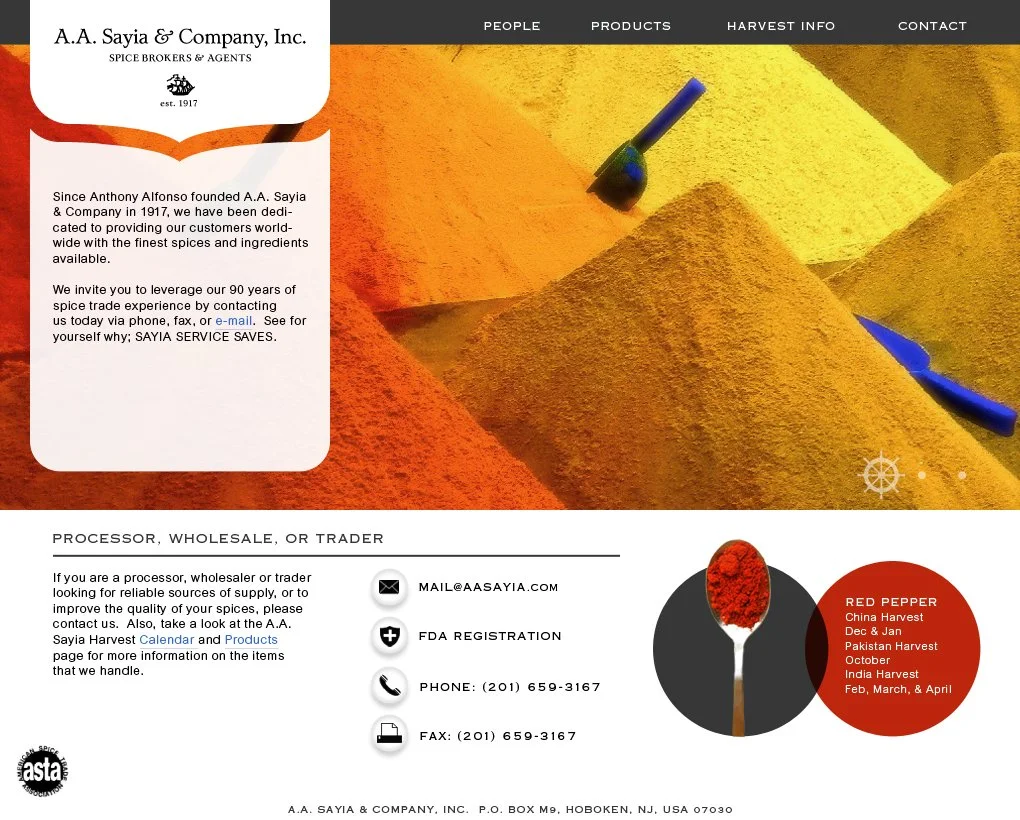
The refined identity for A.A. Sayia & Company, Inc. pays homage to its century-old origins while embracing a timeless sense of restraint and sophistication. The wordmark employs a carefully customized serif typeface chosen for its graceful ligatures and proportional balance. These details speak to both the company’s founding partnership and its enduring role in international trade.
Accompanying the typography is a heritage emblem—a small ship silhouette that represents exploration, logistics, and the spice routes that define the business. This mark acts as a quiet anchor for the brand, bridging its maritime roots with modern commerce.
The color palette draws inspiration from the natural hues of spice and trade: deep olive (#595623), turmeric gold (#F2A007), sun-baked rose (#F2D0A7), cayenne red (#A63208), and dark clove (#730202). Together, they evoke warmth, craftsmanship, and authenticity while maintaining an elegant visual discipline.
When applied across stationery, digital assets, and packaging, the new identity feels both enduring and current—a refined continuation of the A.A. Sayia story, not a departure from it.
💵 Results & Impact
Successfully reintroduced a heritage brand with contemporary polish
Modernized typography and mark system adaptable for both print and digital media
Reinforced company positioning as a respected global broker within a niche market
Strengthened brand perception among partners through elevated presentation. McCormick Herbs & Spices requested RFP following A.A. Sayia web launch.
🛠️ Tools & Deliverables
Tools: Illustrator, Photoshop, Figma
Deliverables: Primary and secondary logo marks, typography system, color palette, stationery design, brand usage guide, website design
💻 Roles & Team
Color Culture Roles: Creative Director, Brand Designer, Web Designer
Collaborators: A.A. Sayia leadership team
“A heritage brand, modernized with care and precision—where every ligature, line, and hue tells a story of trust and trade.”
This project represents the essence of Color Culture Design’s philosophy: evolving legacy brands with respect for their past and clarity for their future.
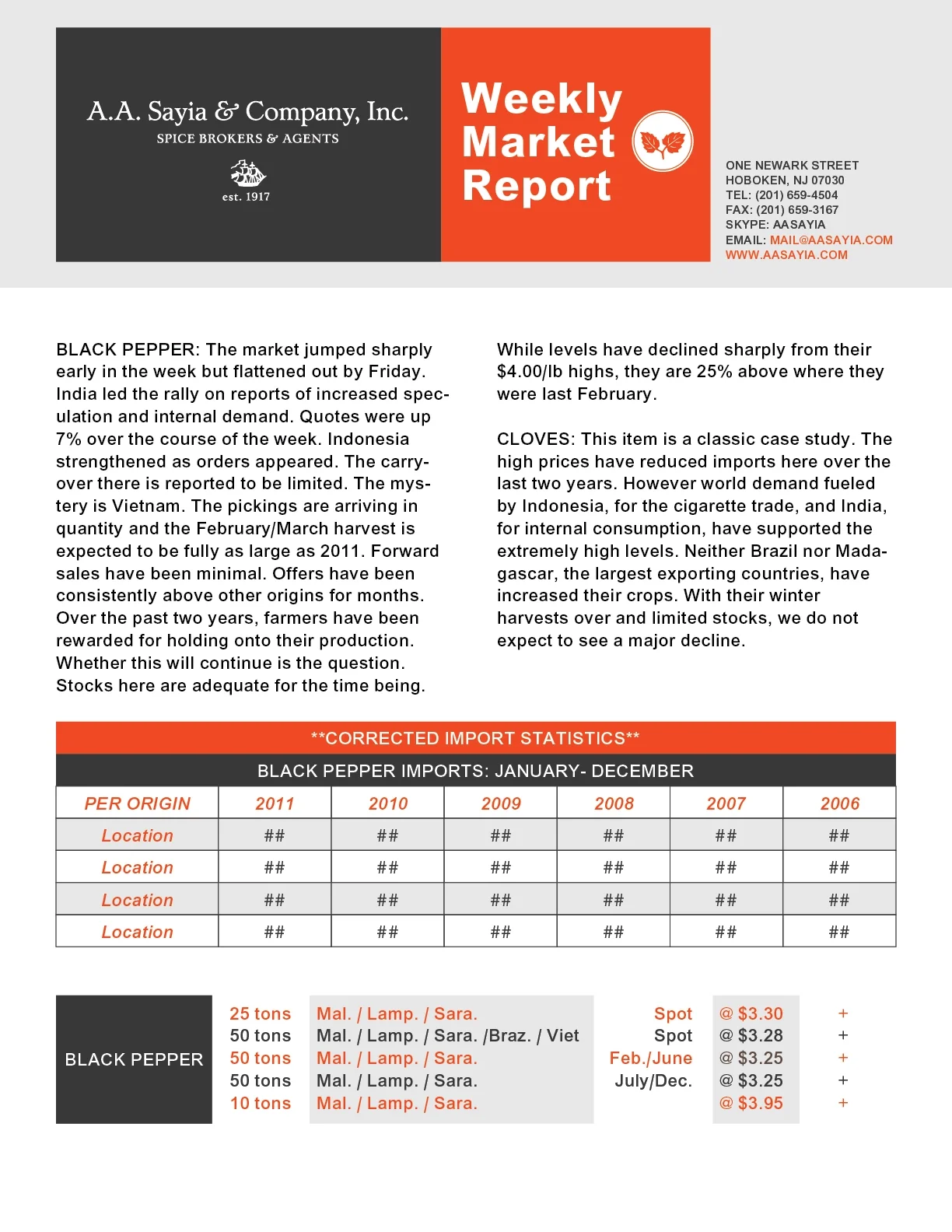
A.A. Sayia Weekly Client Mailer

A.A. Sayia Website Home Page Redesign
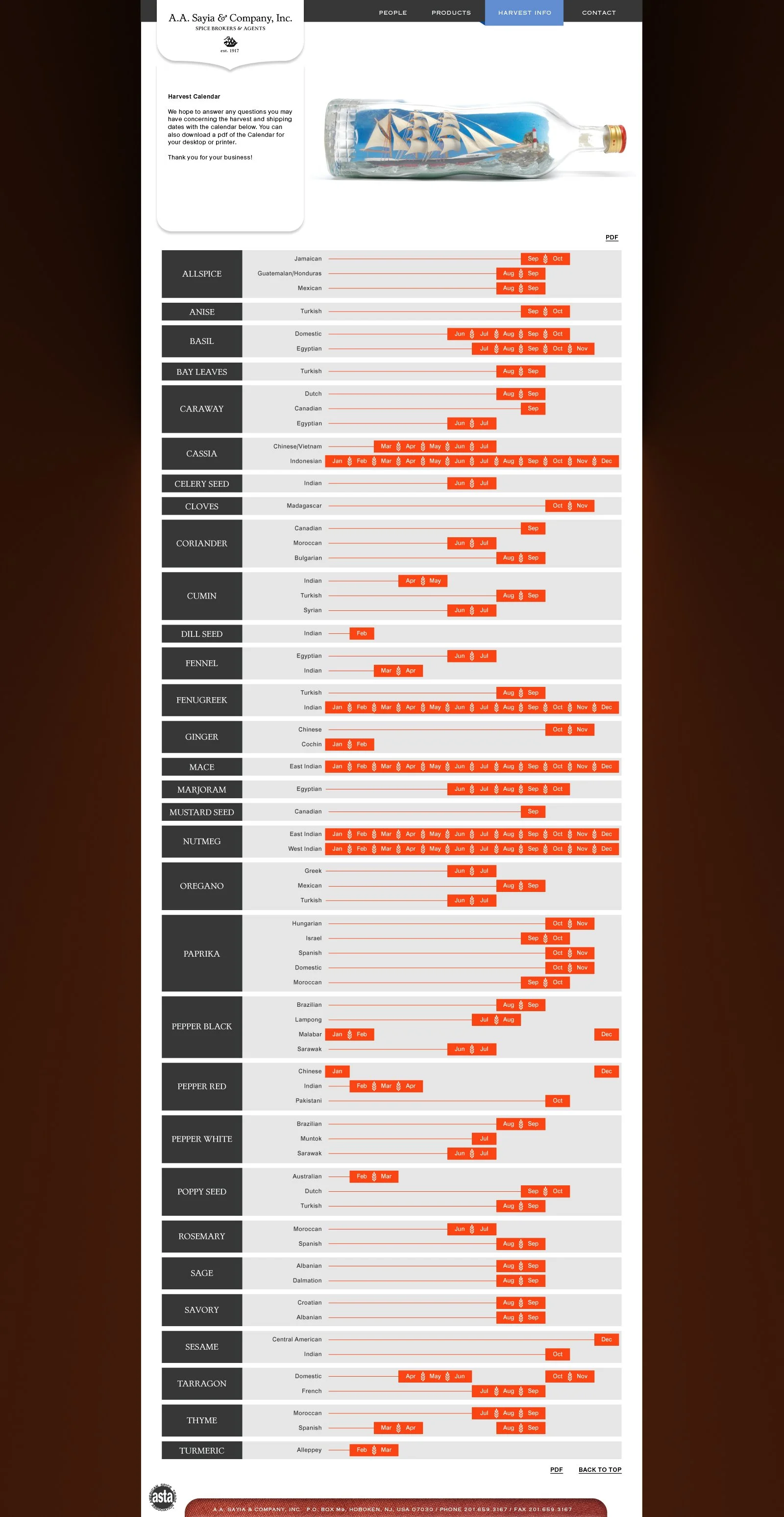
A.A. Sayia Website Harvest Calendar Redesign
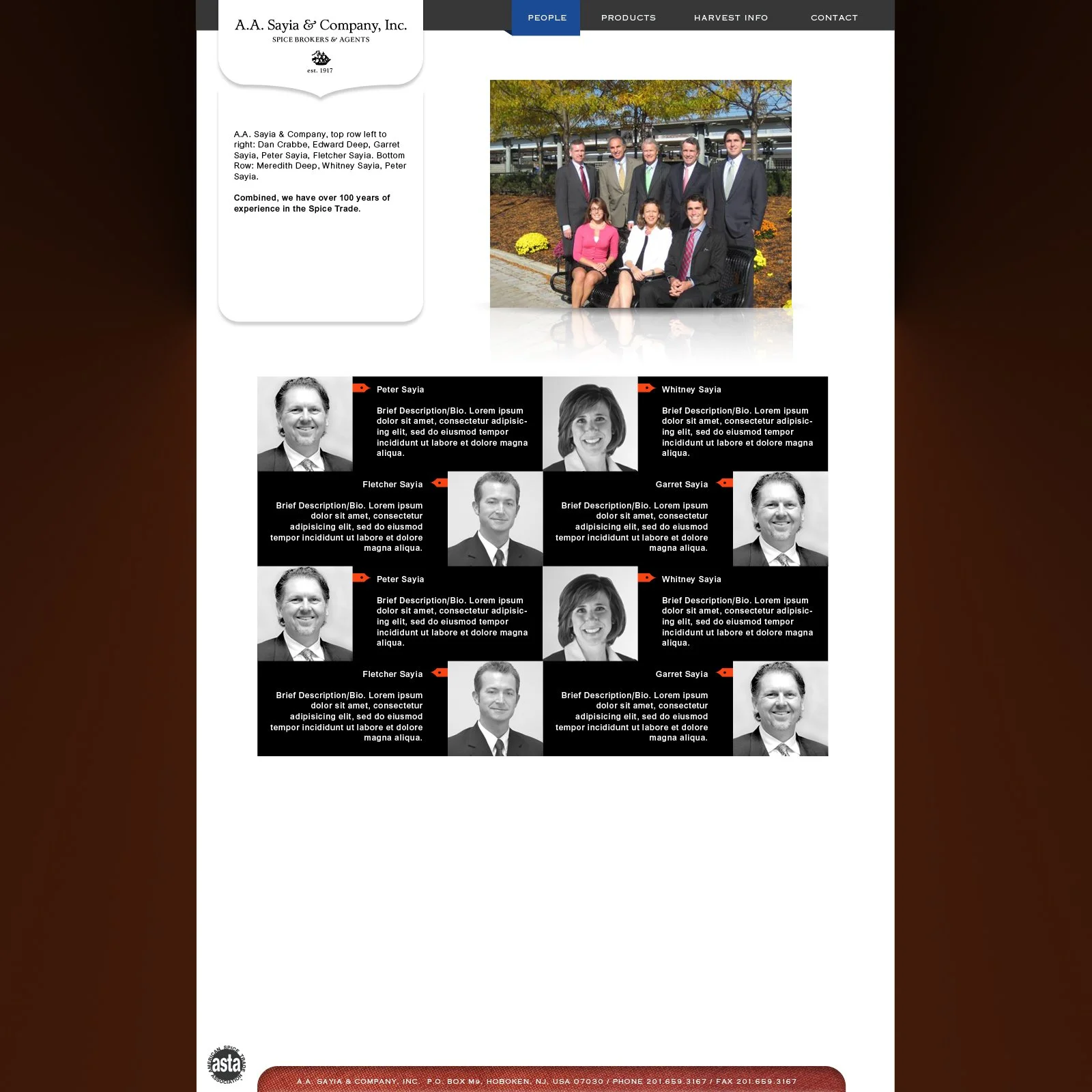
A.A. Sayia Website Redesign - About Section
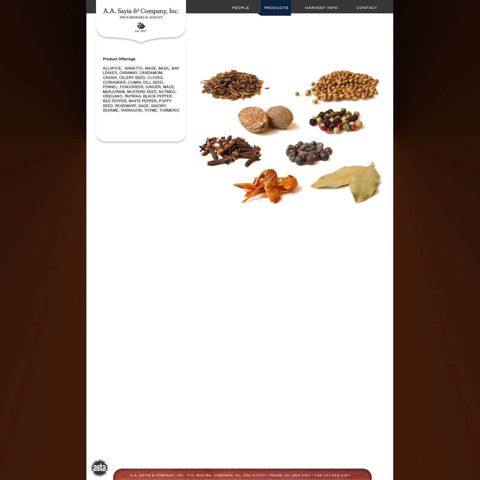
A.A. Sayia Website Redesign - Products Section
Refining a century of Spice Trade