Client: Judson CRE
Industry : Commercial Real Estate (Manhattan, NY)
www.judsoncre.com
Services : Brand Identity Creation, Website Design & Development, Print Design Collateral
🚀 The Challenge
Judson CRE, a Manhattan-based commercial real estate firm, approached Color Culture Design to create a brand mark that captured the precision and stature of the New York skyline. Their goal was to establish a refined, architectural identity that would reflect both trust and sophistication — one that would hold its presence across high-end print collateral, digital touchpoints, and architectural glass storefronts.
🎯 Objectives
Develop a timeless brand mark inspired by the geometry of Manhattan skyscrapers
Design a system that conveys strength, stability, and architectural excellence
Ensure versatility across high-end materials, including embossed stationery, glass etching, and metal signage
🛠️ Our Approach
We began by studying the vertical rhythm and proportion of Manhattan’s most iconic buildings, from the Empire State to One Vanderbilt to inform the logo’s form and shadow treatment. Through iterative sketching and digital refinement, we crafted a mark that mirrored a modern tower casting a clean, angular shadow a subtle metaphor for legacy and forward momentum. Typography and color were kept restrained and minimal to amplify the precision of the mark.
💡 The Solution
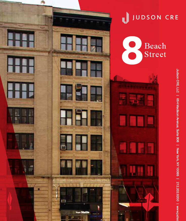
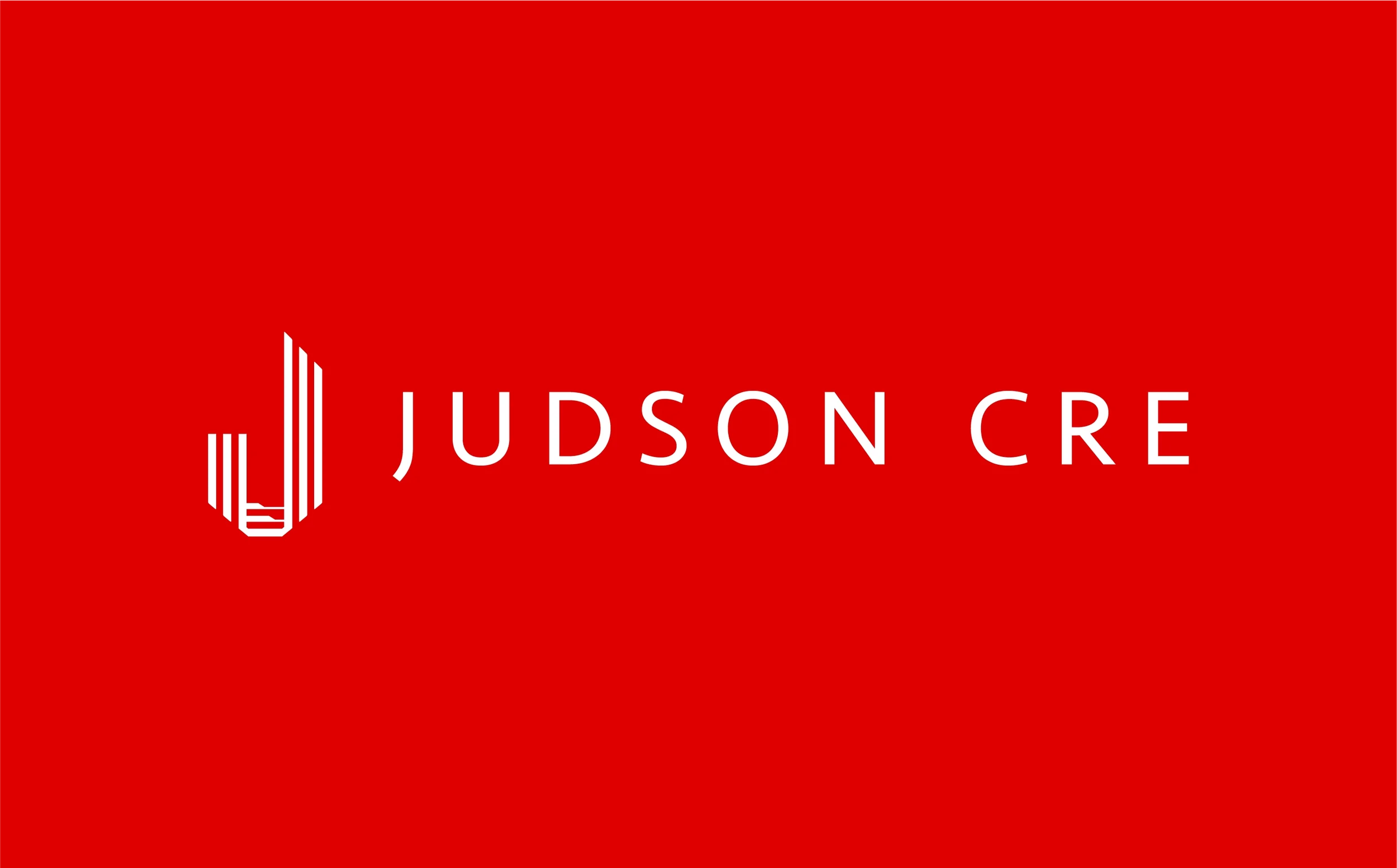
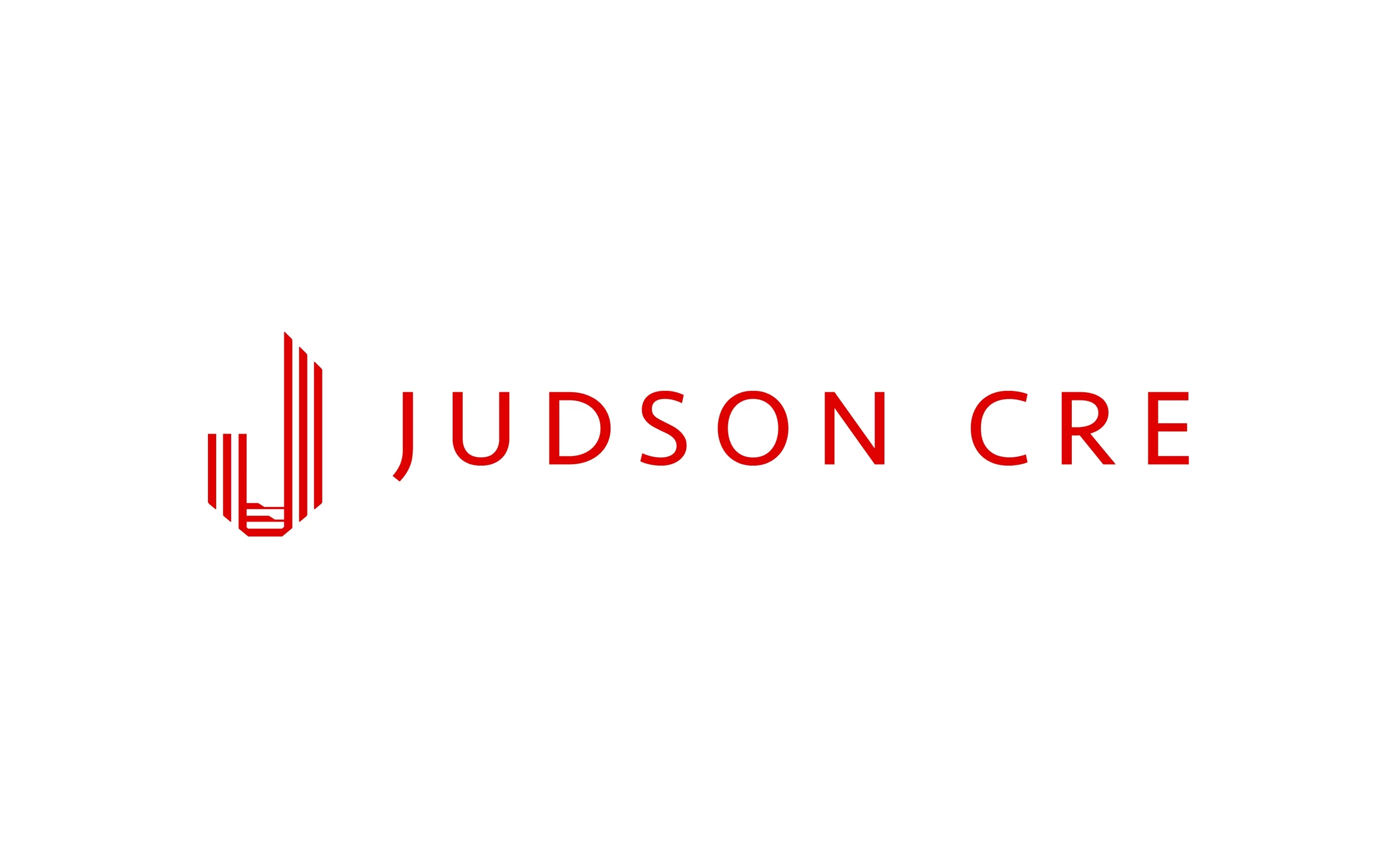
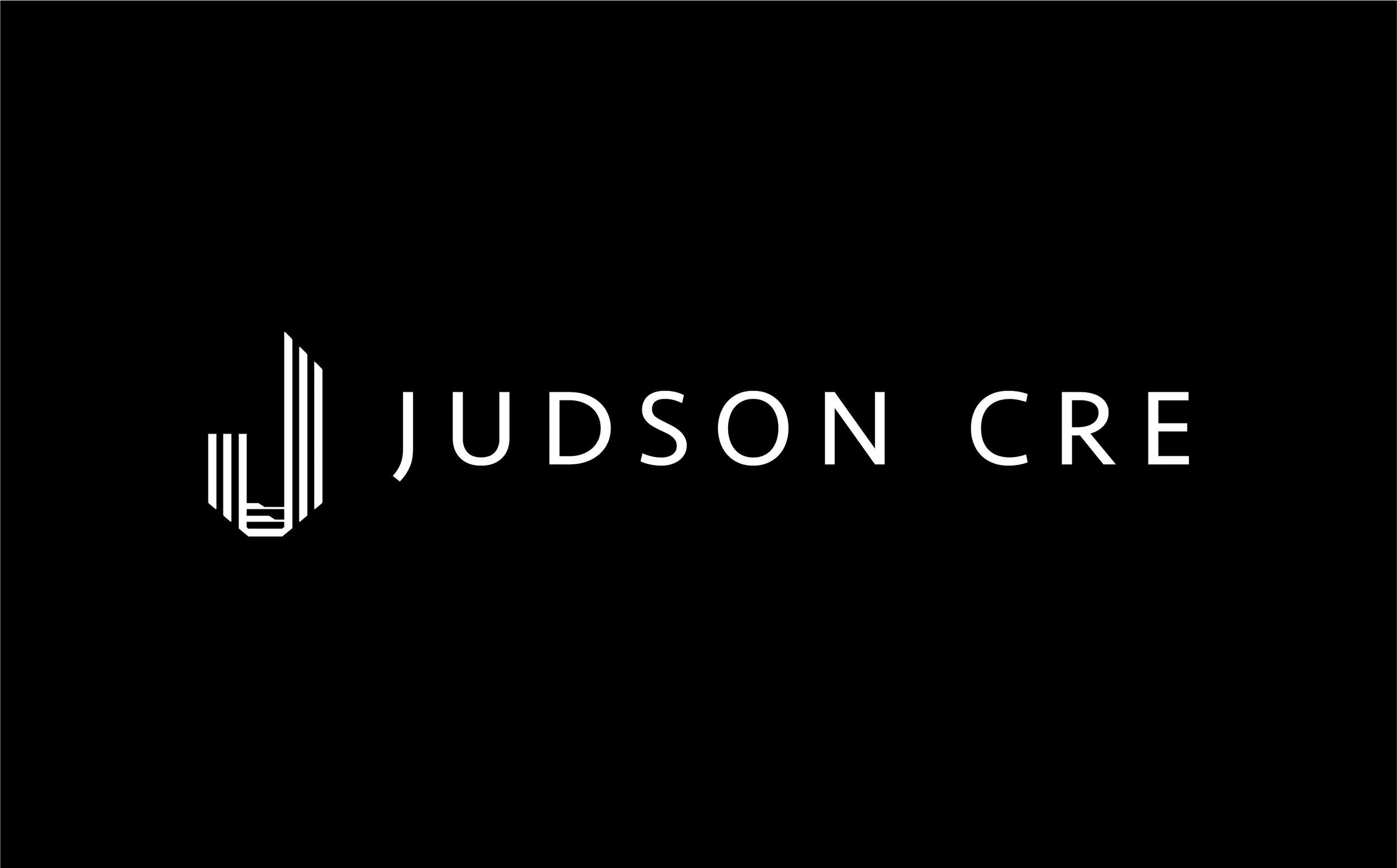
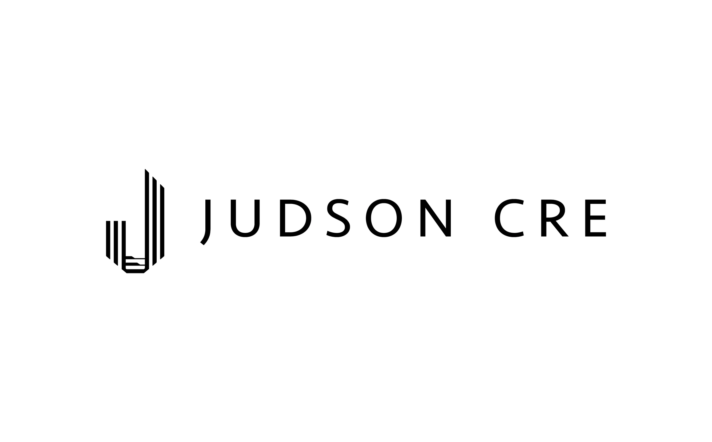
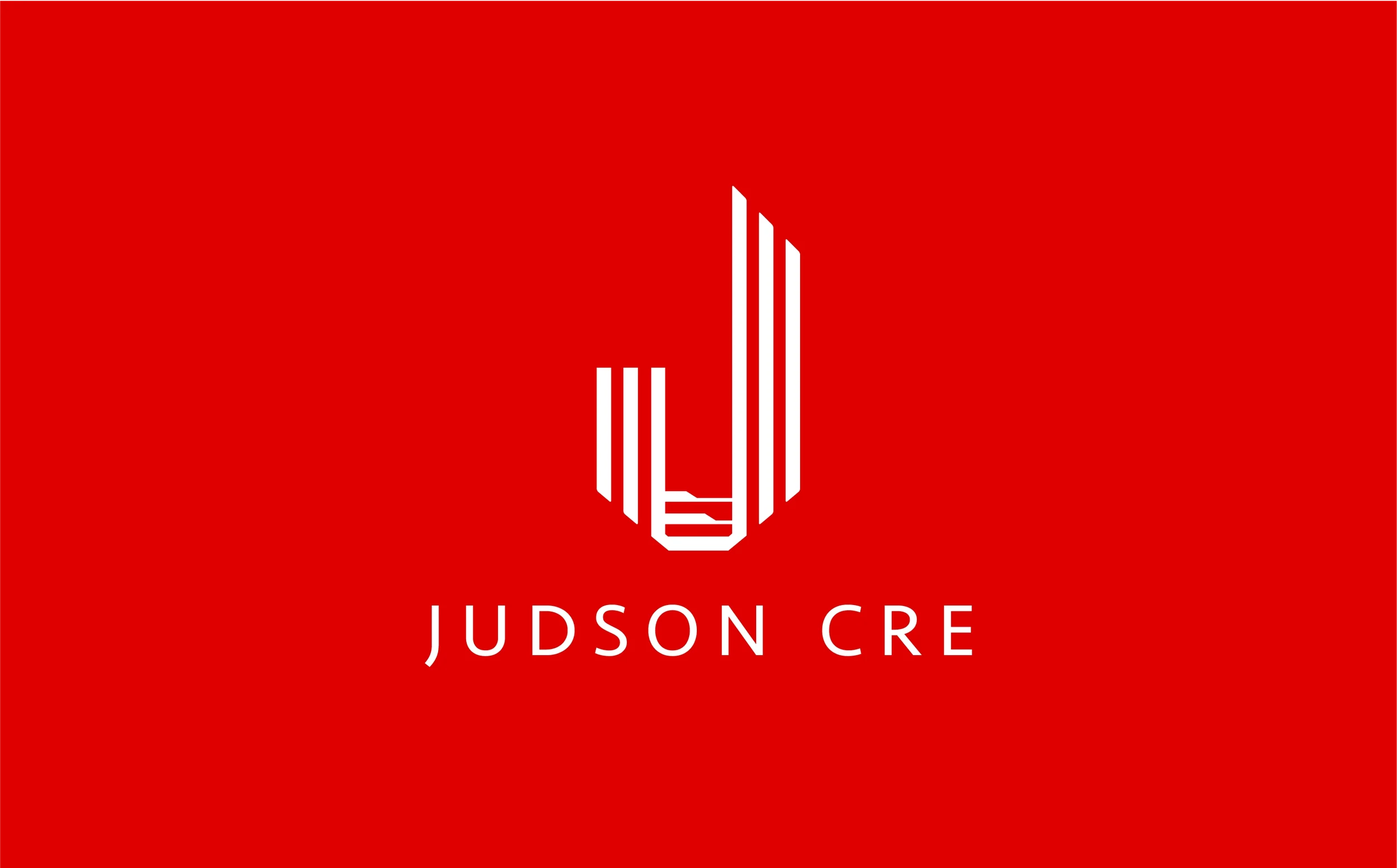
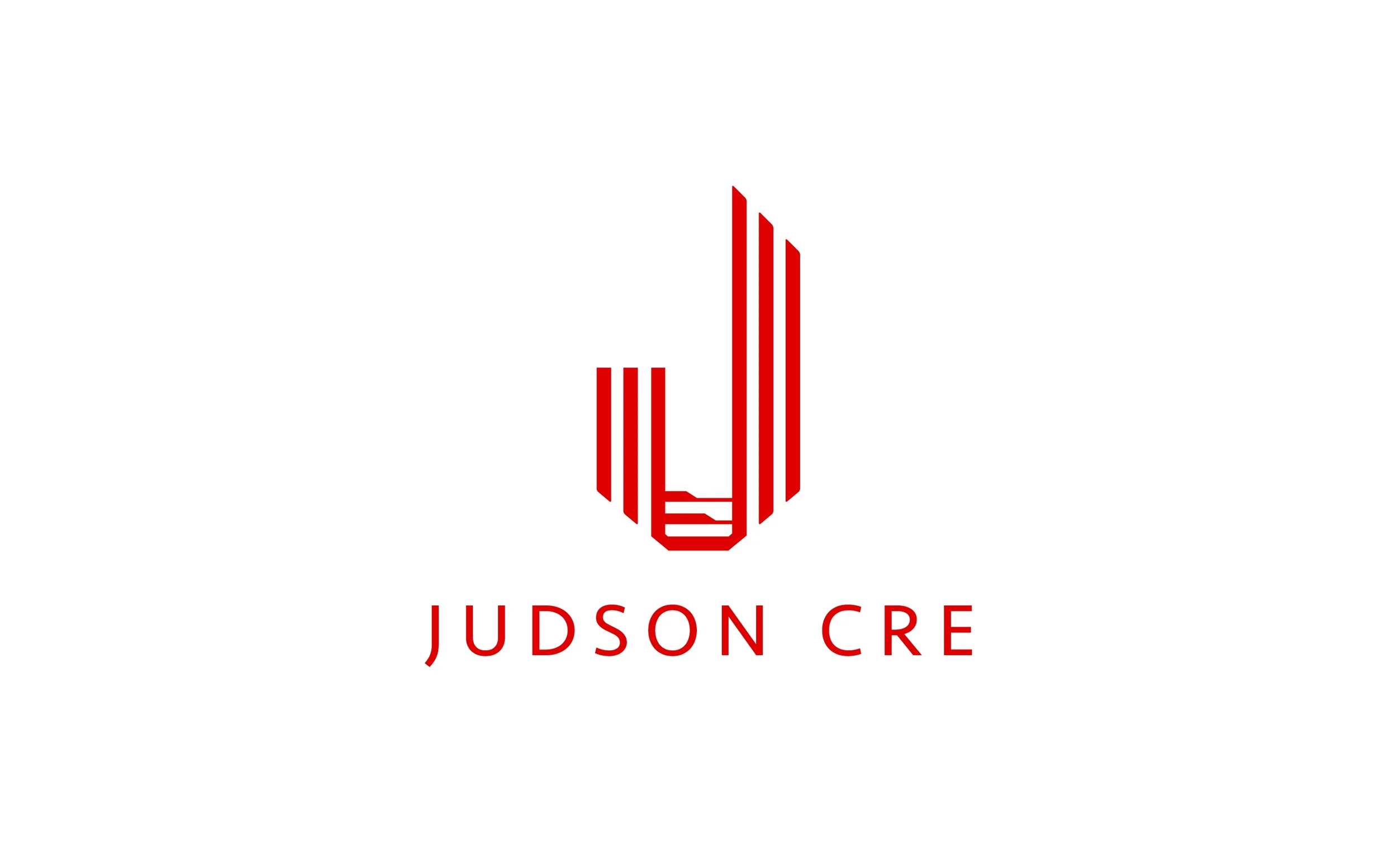
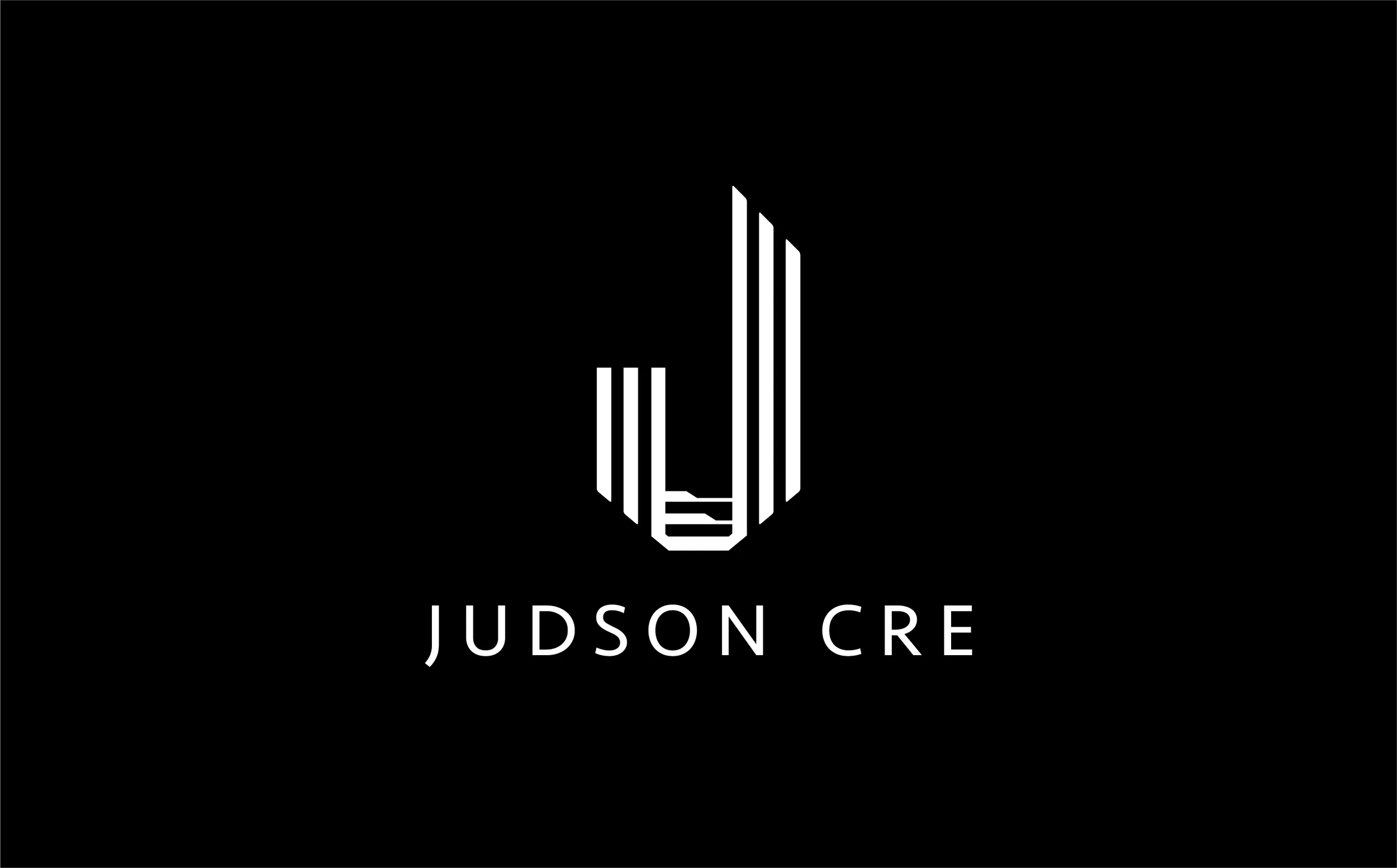
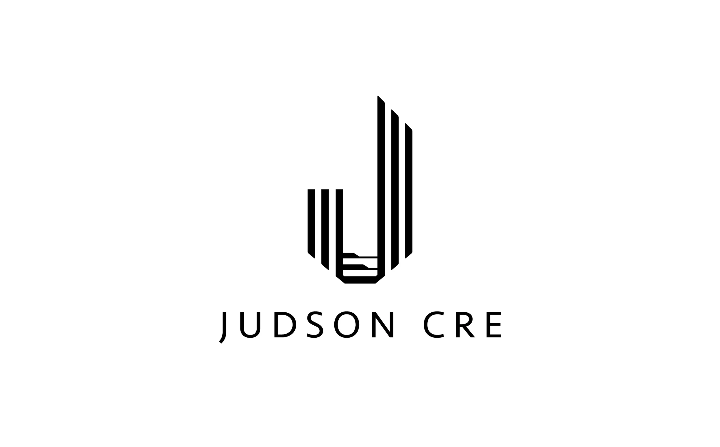
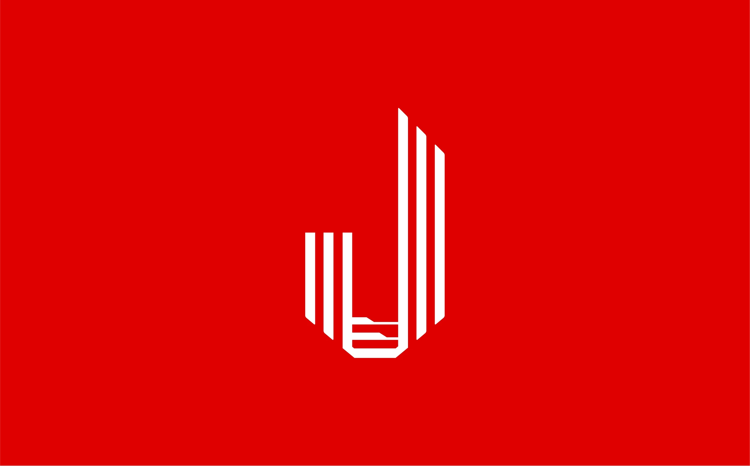
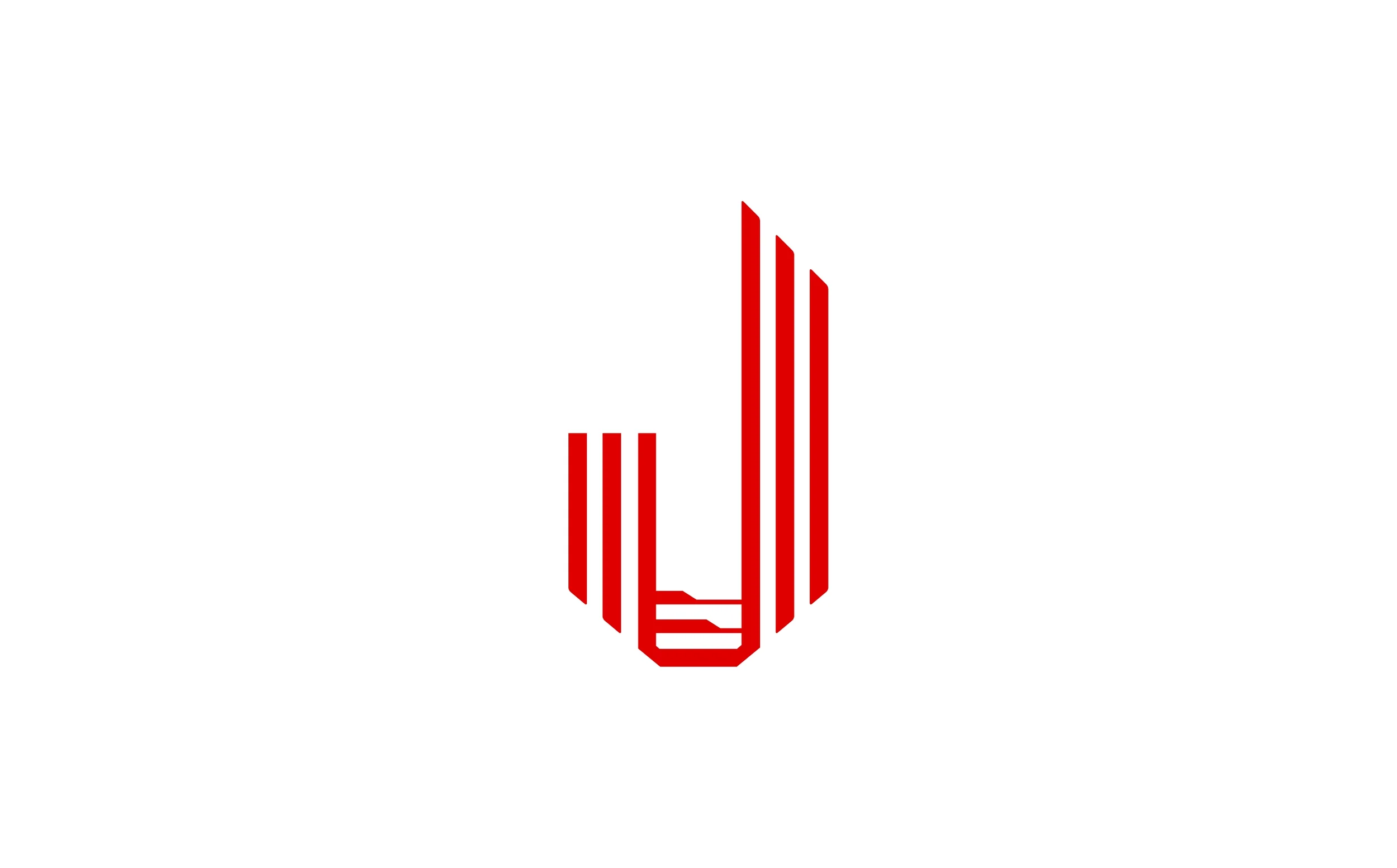
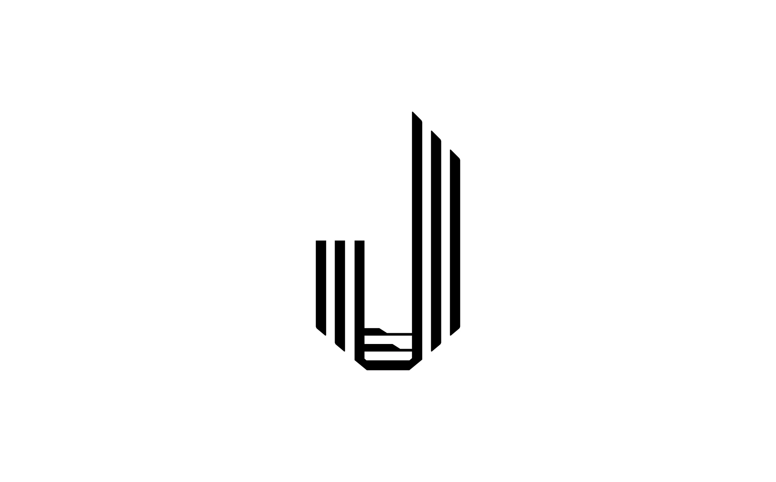
The final identity for Judson CRE centers on a refined architectural monogram — a stylized “J” constructed from vertical forms that evoke the rhythm of Manhattan skyscrapers. The design’s geometry suggests both elevation and structure, with a subtle taper that conveys upward movement and precision.
Rendered in a confident vermilion red, the mark balances modern minimalism with visual power. Its negative space forms a natural cast shadow — an intentional detail that gives the logo dimensionality across mediums, from foil-stamped business cards to frosted glass storefronts.
When used in high-end print and architectural applications, the mark’s shadowed base anchors the identity — symbolizing the foundation, stability, and stature of the Judson CRE brand. Paired with a clean sans-serif logotype, the system achieves a visual harmony that feels distinctly Manhattan: sophisticated, structured, and unmistakably premium.

💵 Results & Impact
The new brand mark established Judson CRE as a visual authority in the commercial real estate sector. Clients praised the logo’s architectural subtlety and the elevated presentation across print materials and storefront displays. The design has since become a cornerstone of Judson’s visual identity across their portfolio and communications.
🛠️ Tools & Deliverables
Tools: Illustrator, Photoshop, After Effects (for 3D light simulation), Figma
Deliverables: Primary & secondary brand marks, print collateral system, signage templates, digital asset kit
💻 Roles & Team
Color Culture Roles: Creative Director, Brand Designer, Web Designer, Vibe Coder, Marketing Specialist, SEO Strategist
Collaborators: Judson CRE executive leadership team
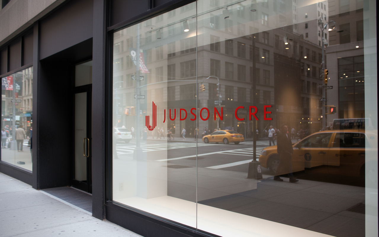
Judson CRE logo branding on storefront window
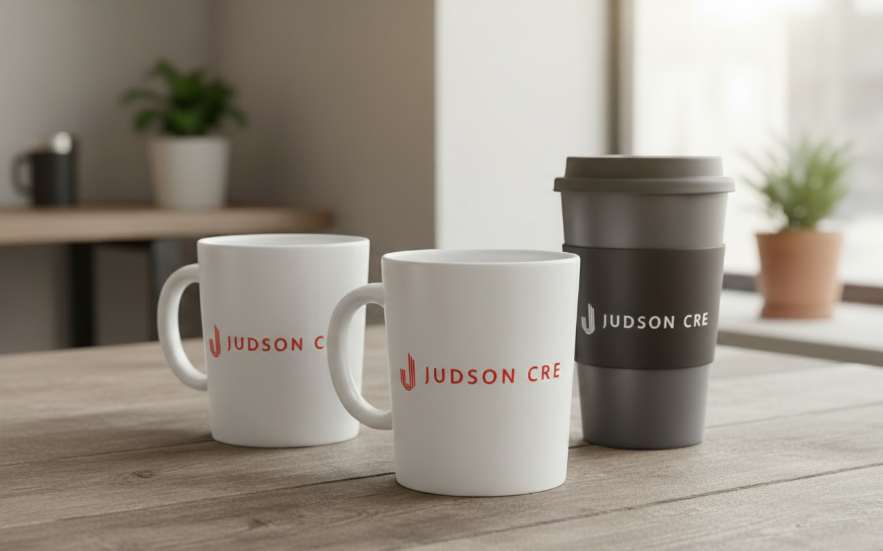
Judson CRE Company Merchandise for commercial real estate tours