
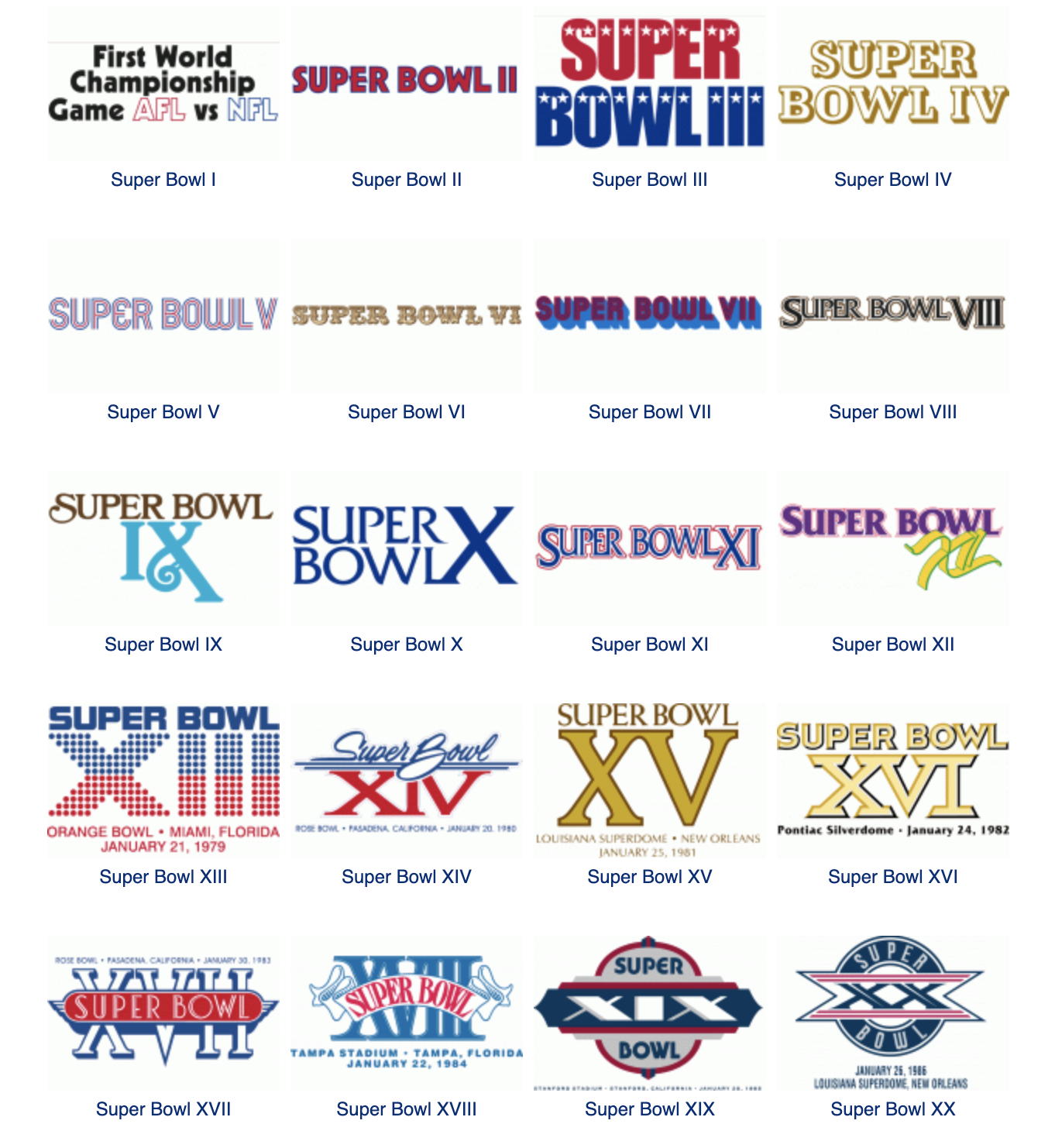
Super Bowl Logo Evolution
GO BIRDS!
Please forgive me for taking a moment to celebrate the Philadelphia Eagles making Super Bowl LVII. I am a Philadelphia native who has made his way north to New York City and eventually settled in Weston, Connecticut. Philadelphia Eagles football is part of my psyche. The sport has helped shape me into the adult I am today after playing throughout grade school, high school, and then collegiately at Division 3 Gettysburg College. The Eagles are Super Bowl bound, and I wanted to celebrate with a post! Now let's bring it back to the design side of things. Super Bowl branding is iconic with its big, bold roman numerals. And rightfully so, it's the top sporting event viewed on a single day across the world.
I found an interesting site that tracks the Super Bowl logos through history, SportsLogos.net. Over the last two years, the logos have been stylized to the game's location.
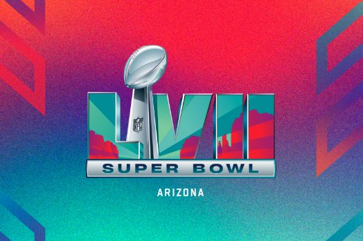
Arizona's Family CBS 5 got some time with the NFL's Senior Director of Creative Design, Chris Stackhouse, to discuss this year's design. Loving the color palette, and having the birds in the big game also helps ;)
Here are some excerpts to the article:
“This year’s Super Bowl logo takes the roman numerals and really creates a window that showcases the awesome, beautiful landscape of Arizona,” Stackhouse said.
“The Super Bowl logo is like a time capsule. It says something about that place and what’s so creative and vibrant about where our Super Bowl is lucky enough to be hosted,” Stackhouse said. “There’s so much rich visual, cultural, and artistic history to tell. That’s something we really wanted to celebrate and bring to life through the art and through the storytelling through some really exciting collaborations and partnerships that are going to be part of the Super Bowl in Arizona.”
The Super Bowl logo has undergone several transformations since its inception in 1967. The first logo featured the NFL and AFL shields, symbolizing the merger of the two leagues. In the 1970s, the iconic Roman numeral was introduced, representing the number of the current Super Bowl edition.
Over the years, the NFL has continuously refined its brand guidelines for the Super Bowl logo, ensuring consistency and versatility in its use. The league places a strong emphasis on maintaining the integrity of the iconic design, while also incorporating elements that reflect the host city and theme of each year's game.
With the advancement of technology and the increasing importance of digital media, the NFL has adapted its brand guidelines to ensure the Super Bowl logo remains relevant and easily recognizable across all platforms. The current guidelines outline specific requirements for color, typography, and usage, allowing the NFL to maintain the prestige and recognition of the Super Bowl brand.
In conclusion, the Super Bowl logo has evolved over the years to become a symbol of the biggest sporting event in America, and the NFL has worked tirelessly to maintain its relevance and integrity through strict brand guidelines.